anyway you spin it direct mailer
graphic designer
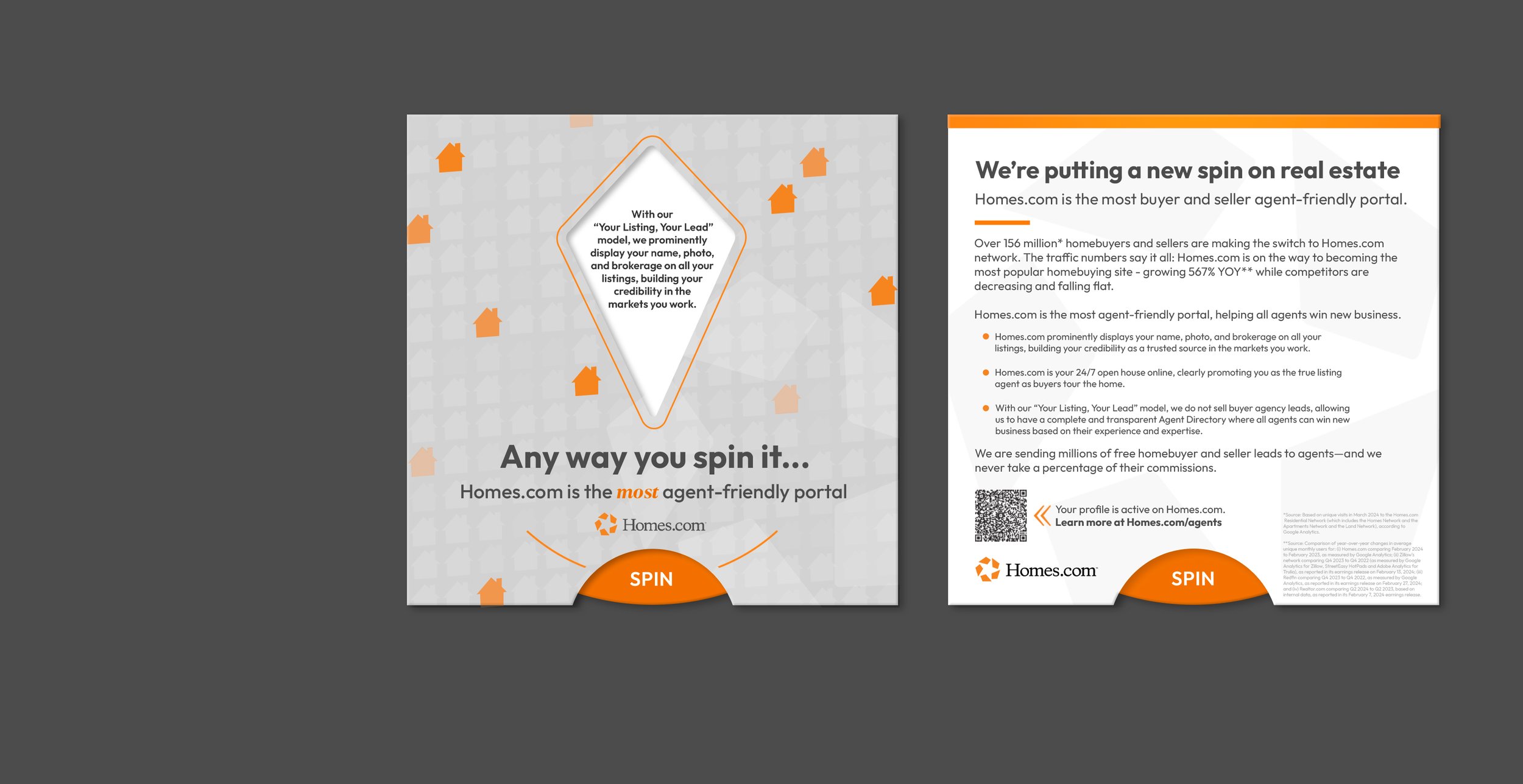
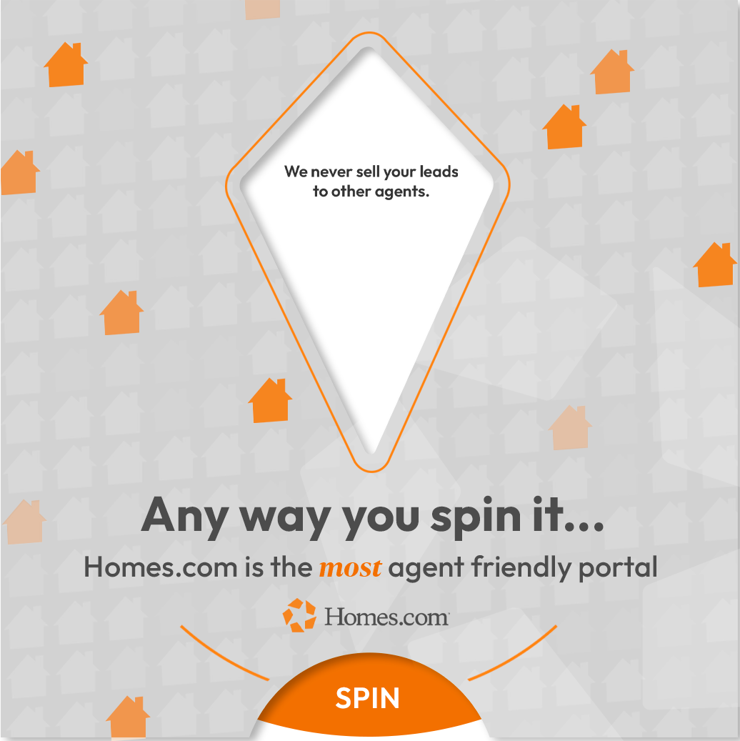
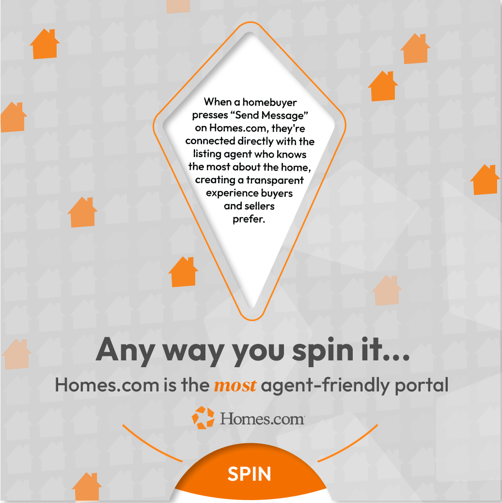
an interactive direct mailer in the form of a spinner reminding agents that agents always win on homes.com.
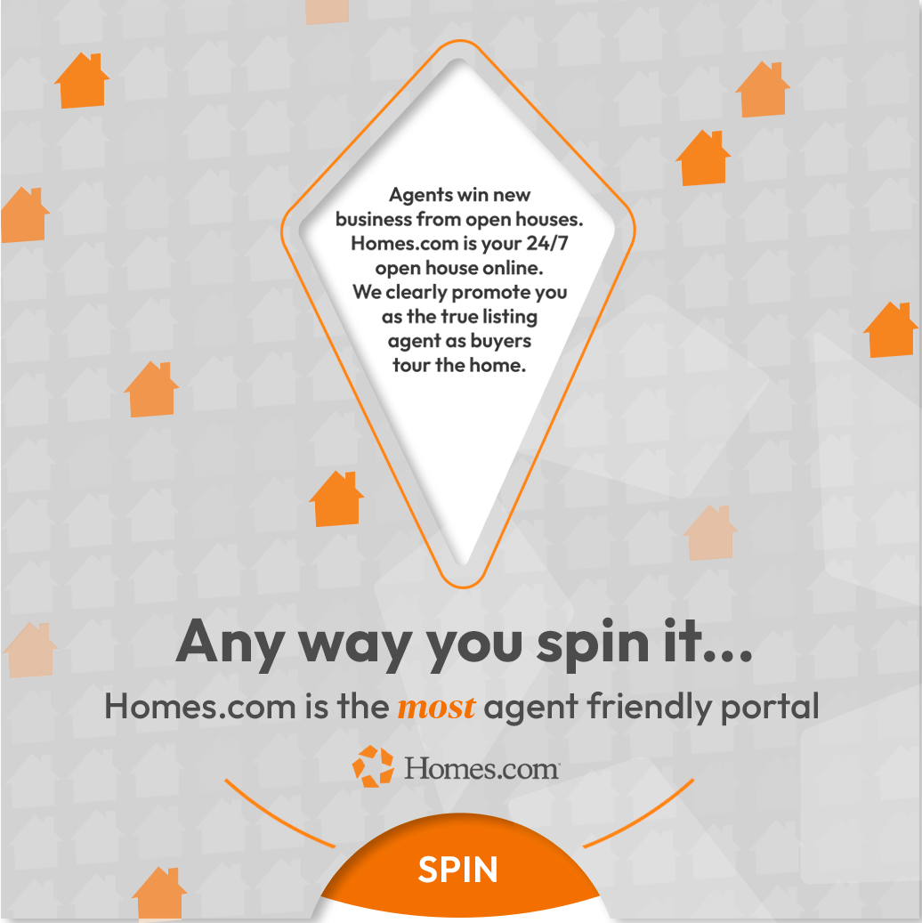
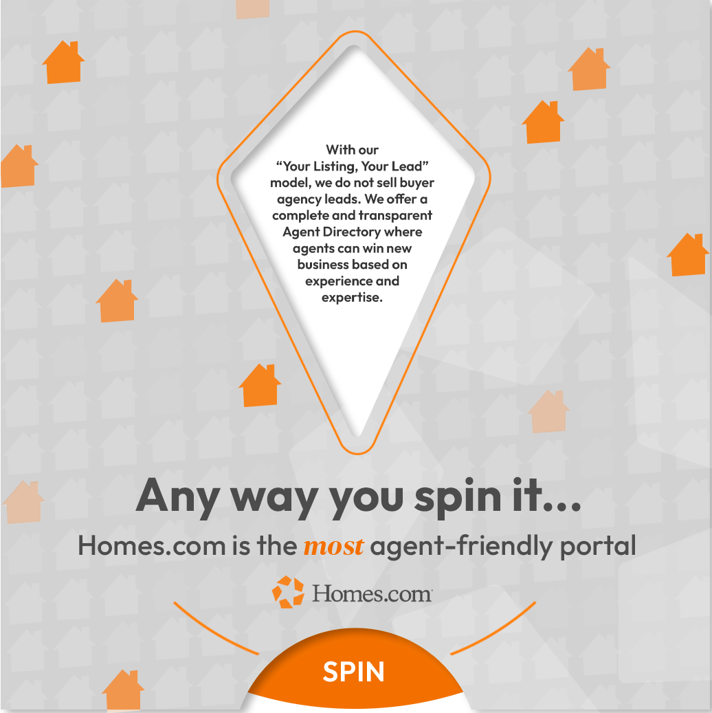
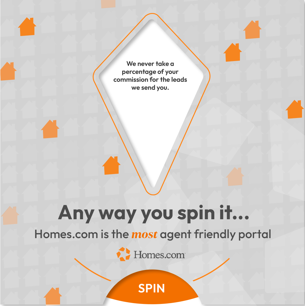
this project was inspired by the idea that agents benefit from using homes.com, more than other real estate platforms, which is where “anyway you spin it…” came from. from there, i naturally thought of the idea of creating a physical spinner that would reveal statistics, facts, or benefit statements of why homes.com is agent-friendly. this mailer has 6 spin views, when rotated, each reveal their own unique fact.
one of the greatest benefits of this project was being able to freely explore the design of this mailer from the overall color scheme to the shape of the die-cut opening to the house pattern. this mailer was created soon after homes.com began shifting its brand identity to being a bit more clean and sleek, so i was able to get creative with the pattern and texture of this piece, which was exciting. the house pattern that is featured, i vectorized in a variety of color schemes for the brand, including an orange gradient, grey pattern, white pattern, and grey/orange combo pattern. the biggest challenge that came along with producing this mailer was ensuring the mechanical side of things were correct—the mailer was big enough for all the text to be legible, the text fit within the die-cut wheel reveals, the spin wheel rotated properly, and so on. in order to ensure all of these factors were correct, i worked with a vendor to repeatedly check prototypes and alter templates until it was just right.
the work included: graphic design, print design, & final mock-ups
note: this project was produced at homes.com, and is the sole property of homes.com.
