official brilliant merch store
graphic designer, ui/ux designer
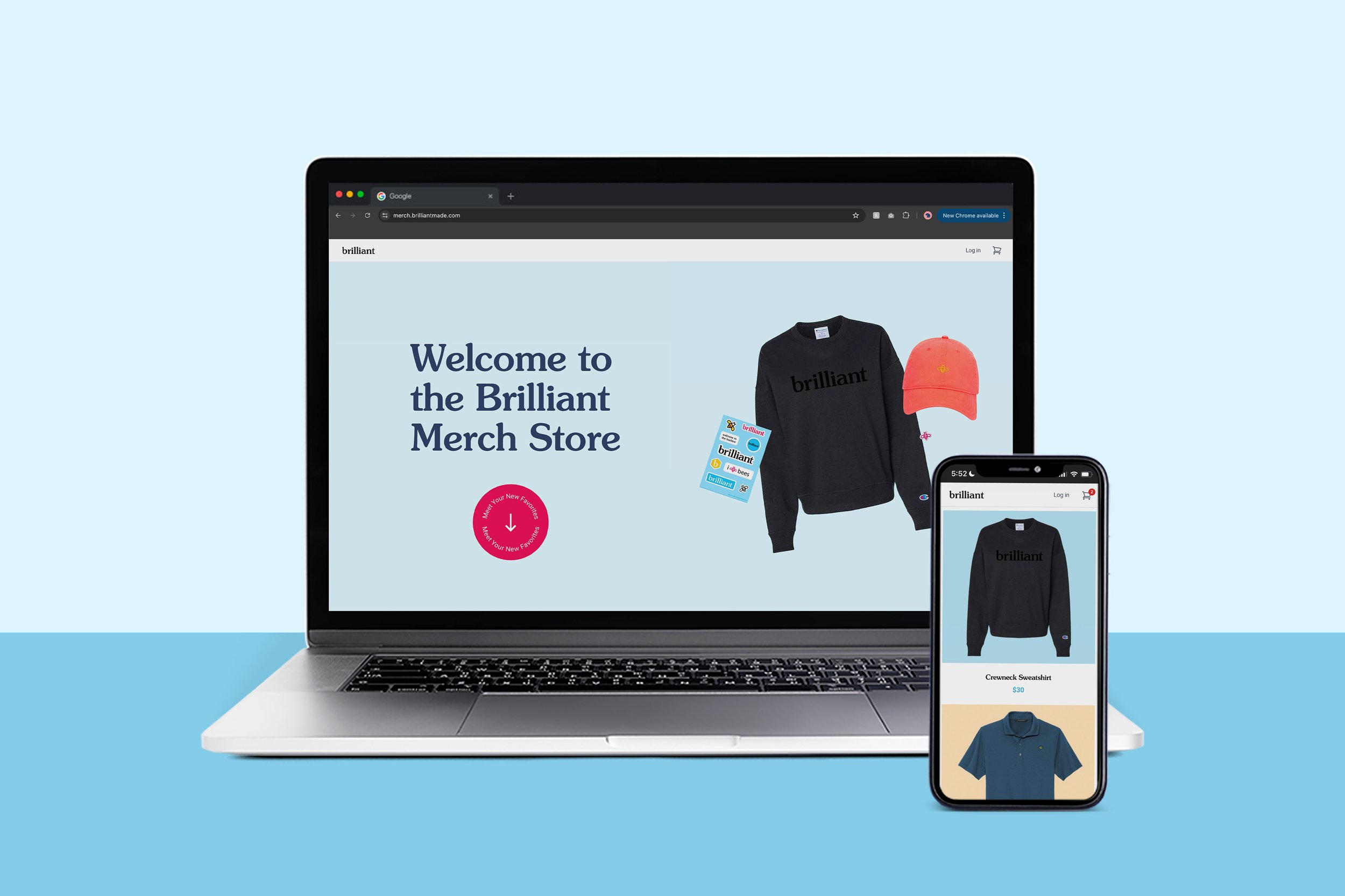
an e-commerce storefront for brilliant’s employees and clients, featuring custom branded merchandise.
this website design is the official merch site for brilliant. the merchandise is available for both brilliant employees and clients to purchase.
i was the sole ui/ux designer on this project, working on it from concept to launch. i also designed a large portion of the minimally-branded apparel and merchandise that the storefront sells.
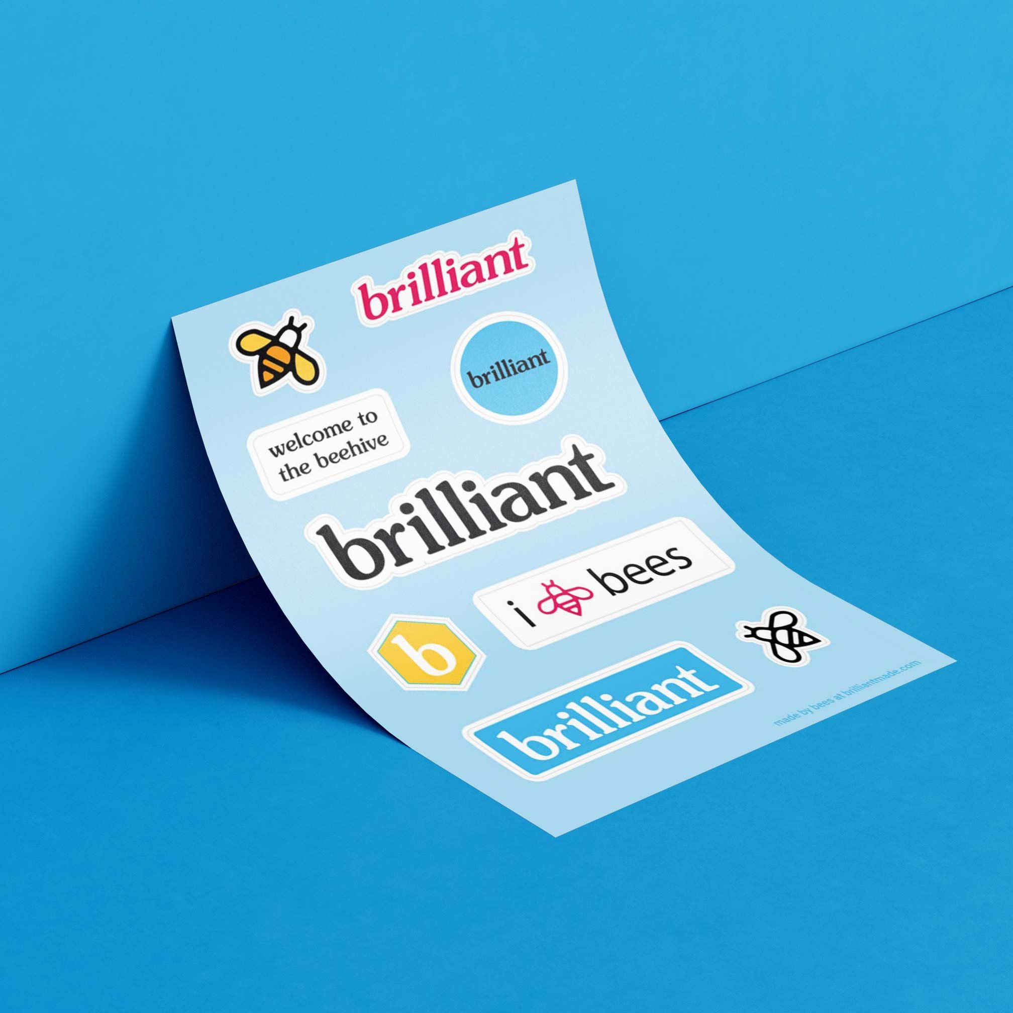
brilliant went through a rebrand shortly before this merch storefront was released, so the site was a sort of rebrand reveal, if you will. the rebrand launched their new slogan: “corporate gifting for humans”. that slogan was the focal point of the rebrand; the bubbly logo, bright, cheery colors, typeface pairings, fluid illustrations, and the mascot of the (worker) bee.
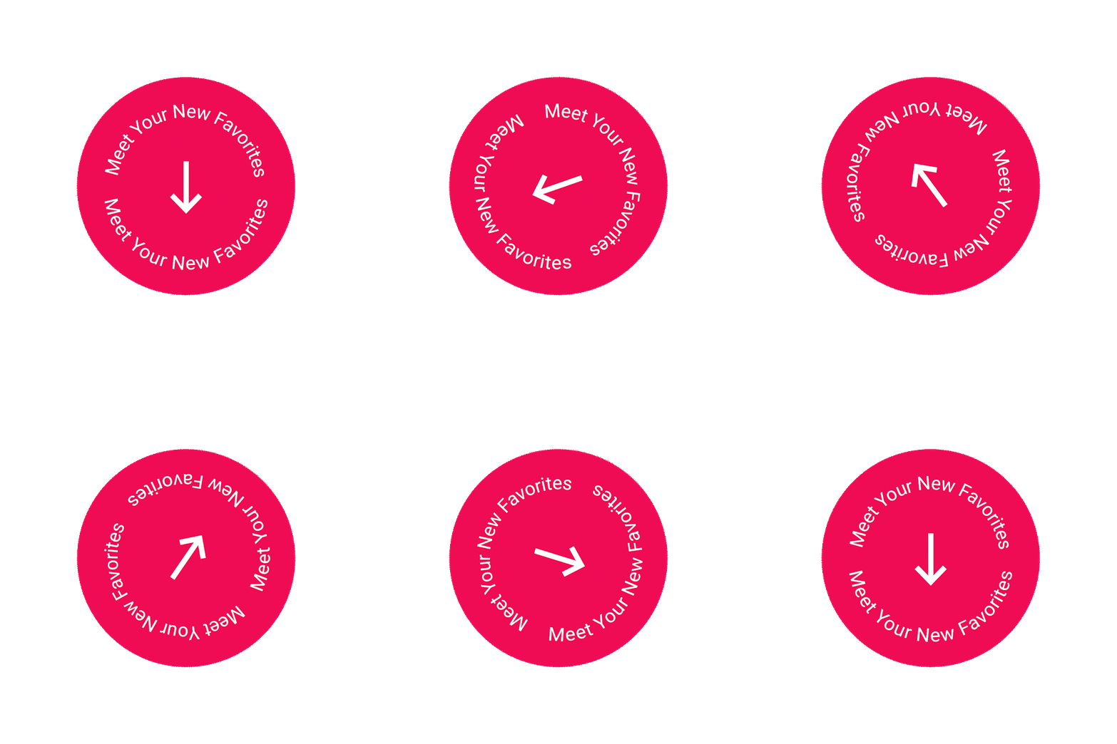
since brilliant had recently been rebranded, my main focus for the storefront was creating a design that highlighted on the playfulness, cheer, and relatable aspect of what being human is. with that idea in mind, all product images in the store feature subtly colorful background images, with some images being animated for an extra flair. the site also features clean grid lines, full-width divider banners, and animated imagery and CTA buttons to encourage an easy user experience. i thought it was important for the overall color of the site to be very clean and minimal since there were so many pops of color coming from the products.
this website design required a decent amount of coding to ensure the page flowed properly, which became the most challenging part of the project. the coding allowed me to customized the layout so it would follow a specific grid pattern, products would pull from brilliant’s images and drop-shipping system correctly, and the interface would transition from web to mobile viewing more seamlessly. during my time at brilliant, i coded varying sites and email designs, but this was the most intricate coding project i had done to-date, making this a fun challenge.
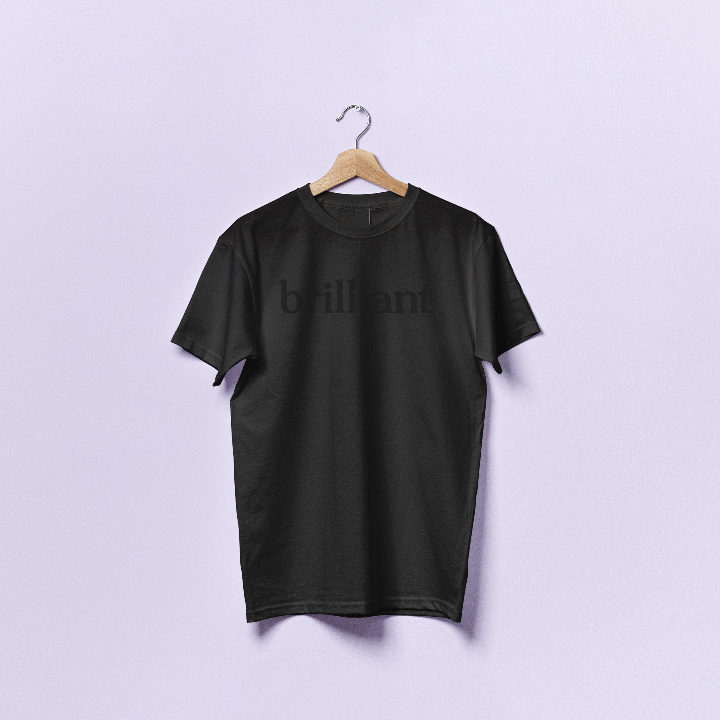
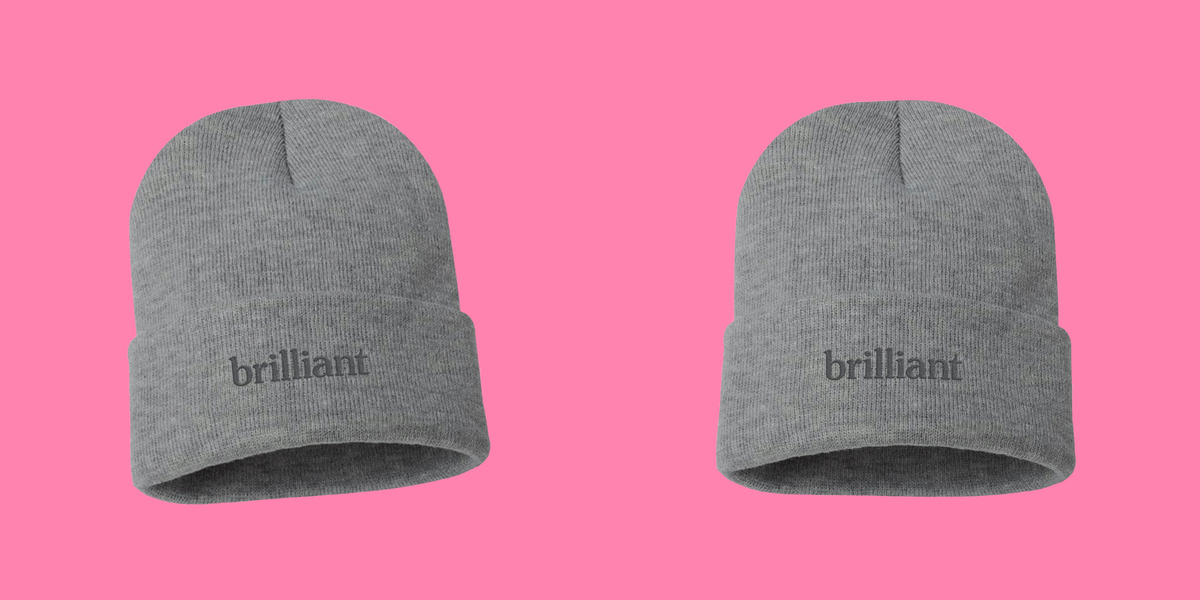
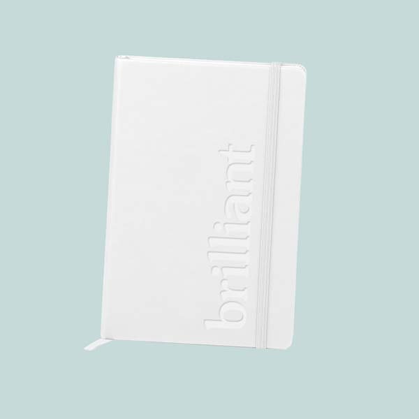
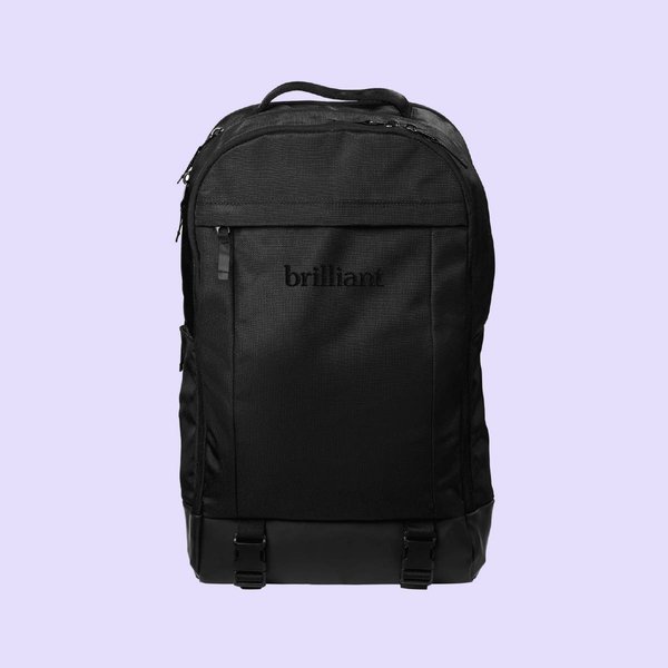
the apparel and merchandise was designed to be very minimal and sleek. we didn’t want it to scream “i’m wearing this company,” but rather, feel empowering to the humans wearing it. it was important to me that the person wearing felt brilliant and comfortable to do the best they can with whatever tasks they needed to accomplish today.
the work included: graphic design, ui/ux design, apparel design, email design, & mock-ups
note: this website design was designed and produced at brilliant. brilliant owns the rights to the site and artwork.

