vccs fastforward site revamp
graphic designer, ui/ux designer
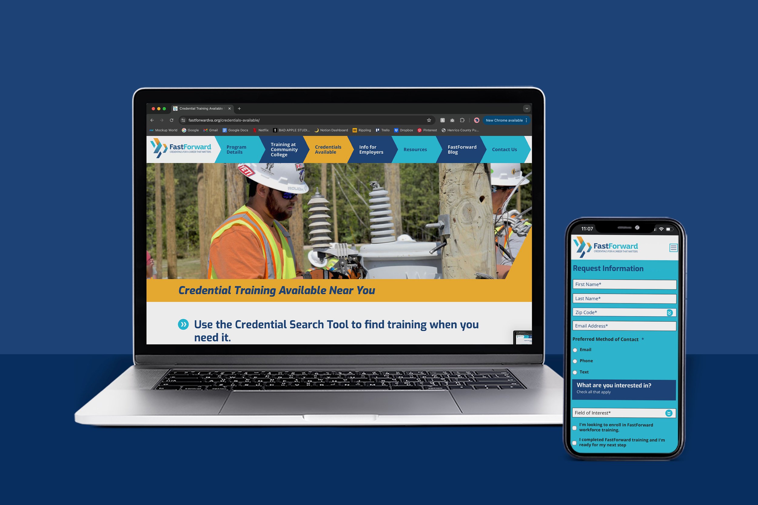
a revamp to the fastforward website, specializing in credential programs for
in-demand jobs across virginia.
this website was created while working as a graphic designer for karnes coffey design. please note: portions of this website had been designed when i joined the project, which the previous designer had set up beautifully.
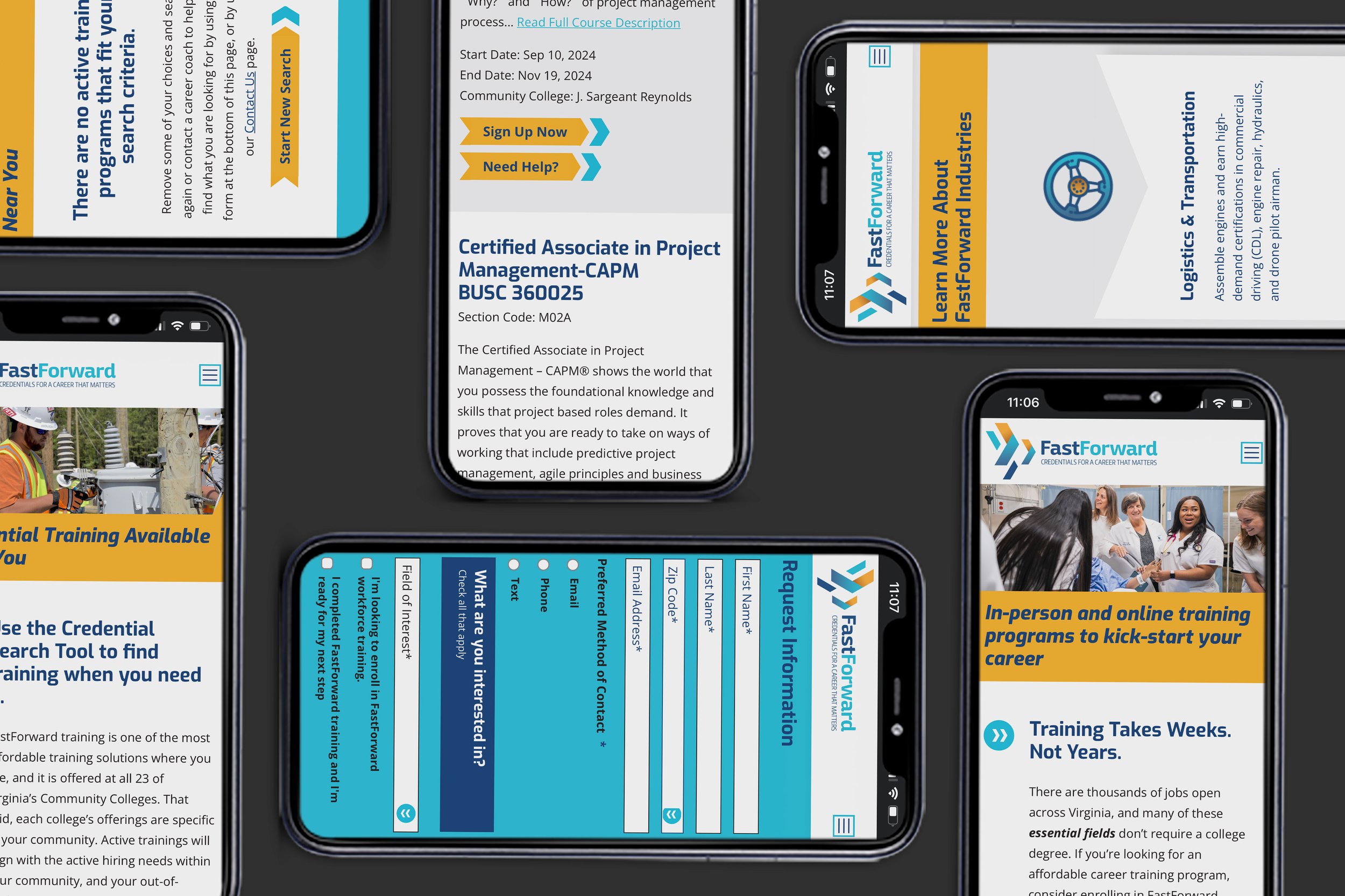
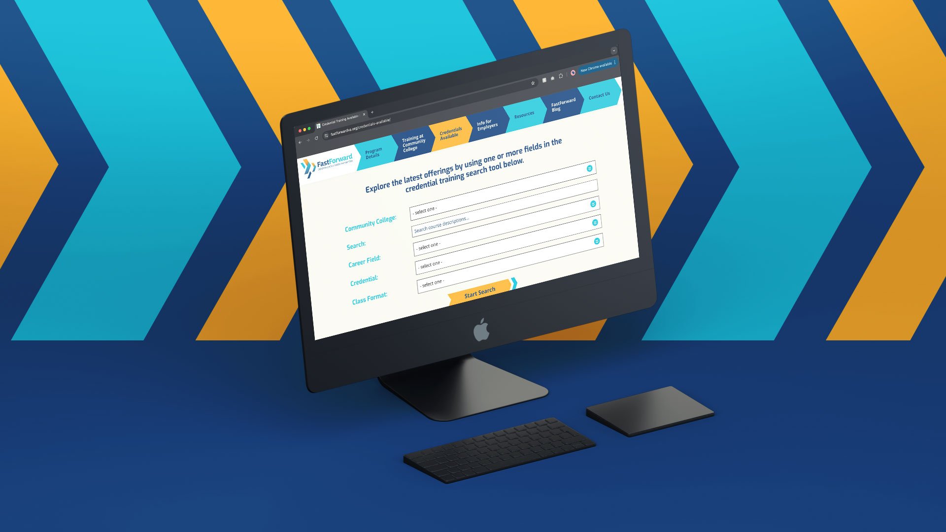
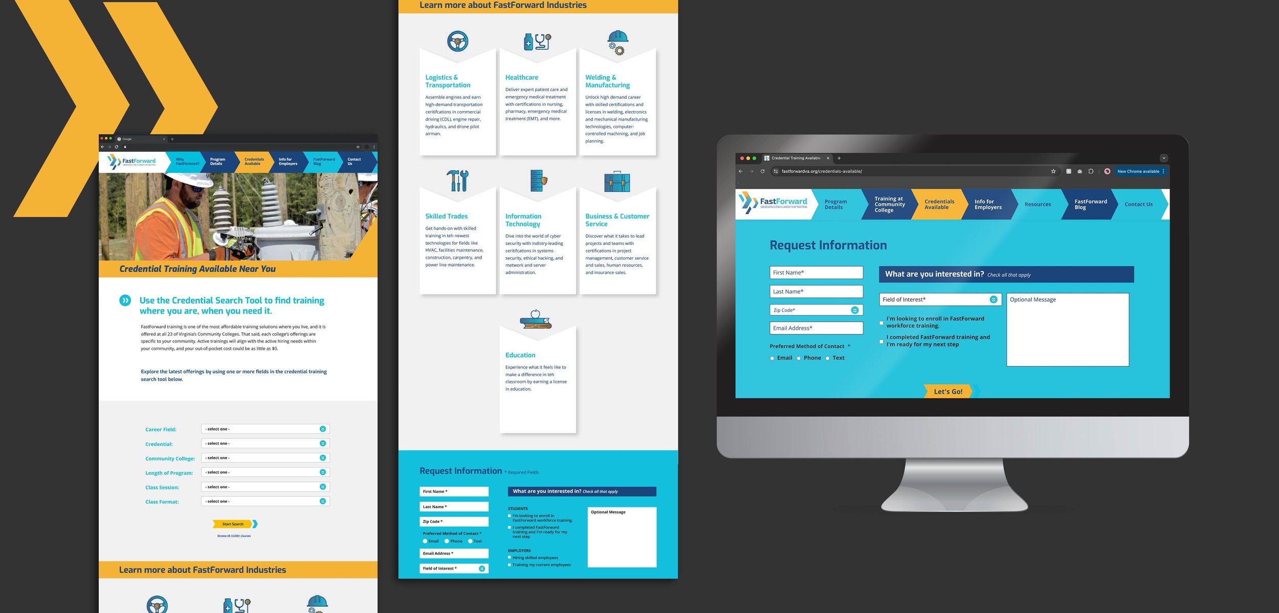
my role in this project was mostly ui/ux-related—i was requested to update and revamp elements of the website and ensure things were consistent across the site. the main pages i worked on was the “credentials” category, including the credentials search page, its results pages, including “no results found” and “# of results found” lists, and the site contact form. my main focus was updating the pages to be more consistent with each other, easier to digest, and more organized. one of the ways i achieved this was by highlighting the hierarchy within the copy and search results, allowing for users to differentiate between sections easier. this meant creating design systems so that things would be consistent across all pages and searches—for example, a system could mean that all headers are the same, all sub-headers are the same, body copy is the same, captions are the same, and so on.
this project was completed early on in my ui/ux design career, but it was a good introduction into web design accessibility as the client’s brand colors lean on the brighter end. this introduction allowed me to deep dive into accessibility, its immense purpose and need, and allowed me to comprehend color palette pairings, functionality, and the overall user experience on a deeper level.
the work included: graphic design & website design
note: this website design was designed and produced at karnes coffey design. karnes coffey studio owns the rights to the artwork.


