hi-impact lottery scratcher mailer
graphic designer
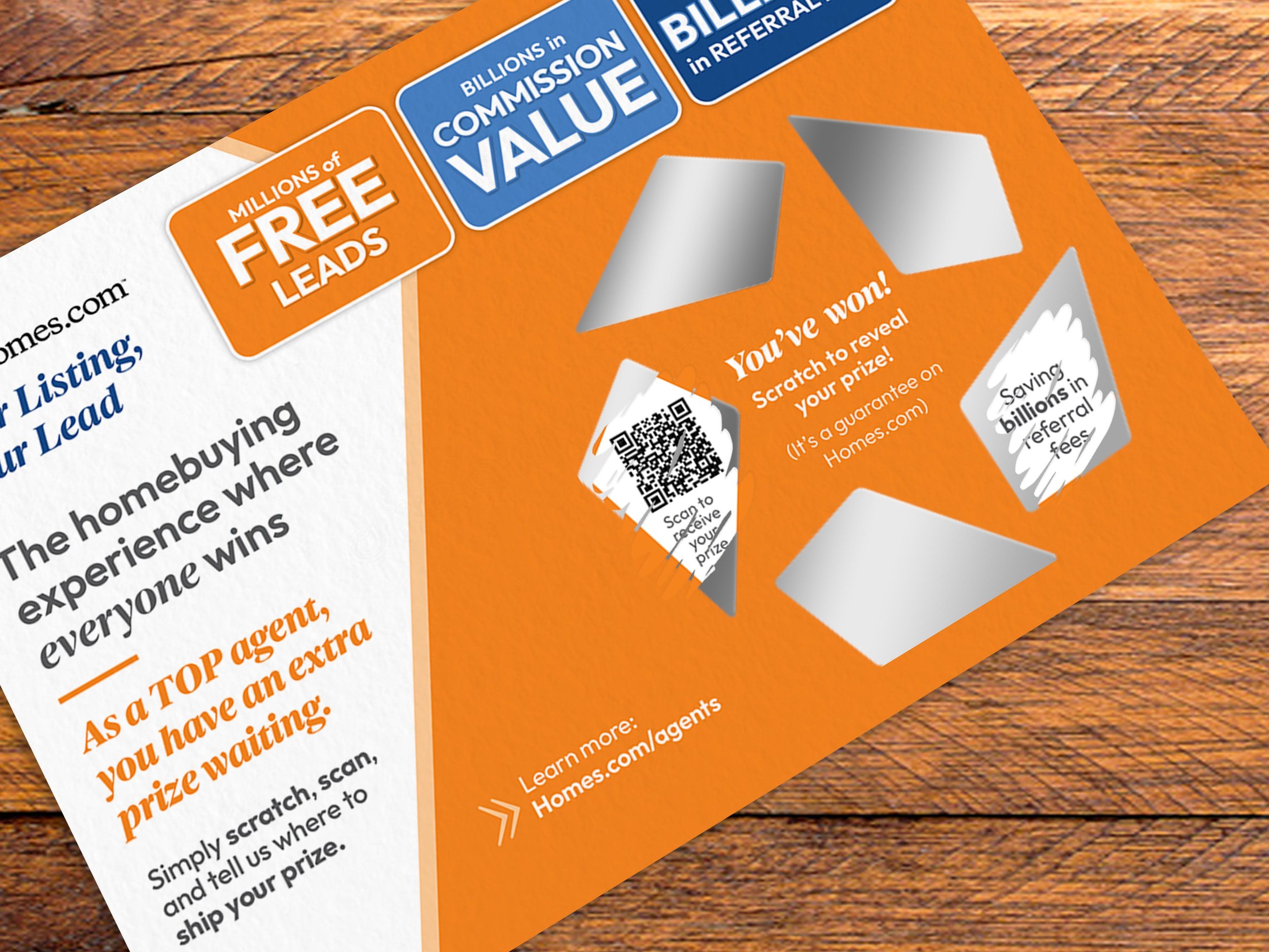
a direct mailer that reinforces the idea that agents always win on homes.com.
this direct mailer is a part of a larger, more extensive campaign known as the hi-impact campaign that was launched in october 2023. this campaign consists of 10 direct mailers that were sent out to agents over the course of several weeks. these direct mailers were not just ordinary sheets of paper or postcards; they were bold, well thought-out concepts, such as a balloon box, a snack box, a 5ft. press release, interactive growth charts, a lenticular, and so on.
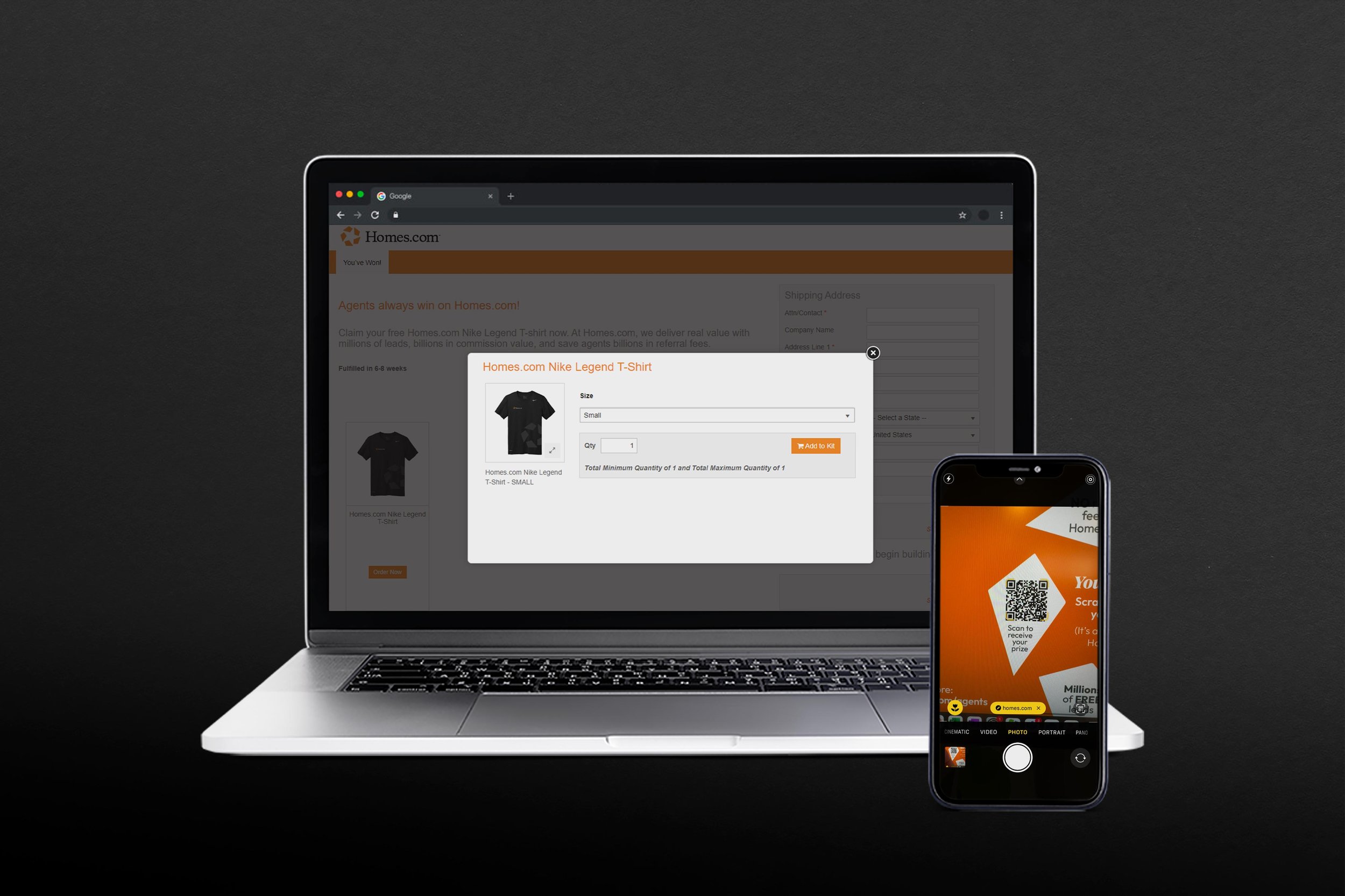
this request for this direct mailer arose after homes.com reached a milestone of 100 million unique visitors in a month. the idea developed when the design team was brainstorming unique ways to showcase the mentioned milestone. once the idea to design homes.com lottery scratchers was established, we knew we needed to take it one step further in order to make the project work properly, such as creating the physical prizes for each scratch-off area and design a separate landing/fulfillment page to house the information, data, and prizes for the scratchers. the exciting part of this project was designing the scratcher itself due to the fact that i was able to work with our supplier to fully customize the scratch-off areas. this included a custom shaped scratch-off in the shape of a pin, forming a pinwheel, which is homes.com’s icon. it was also exciting to work on a direct mailer that required collaboration across several mediums and platforms in order to make the project a success. on the contrary, this mailer posed to be complex as it took several rounds of trial and error on the supplier’s end to determine the proper production steps without sacrificing the design quality, such as when to add the foil, when to print the variable data, and so on.
essentially, this mailer has four versions—one for each of the prize options. all of the mailers have identical designs with the exception of the qr code, which is hidden behind one of the scratch-off areas. the reason we created four versions was to randomize the prizes, which is already predetermined by the qr code. when the user scratches off the scratch-offs, each area reveals a new fact about homes.com. and eventually, it will reveal the hidden qr code that, when scanned, sends the recipient to a fulfillment page where they will receive their prize. overall, this mailer was a success because it’s both interactive, rewarding, and reinforces the concept that everyone wins on homes.com—it’s guaranteed.
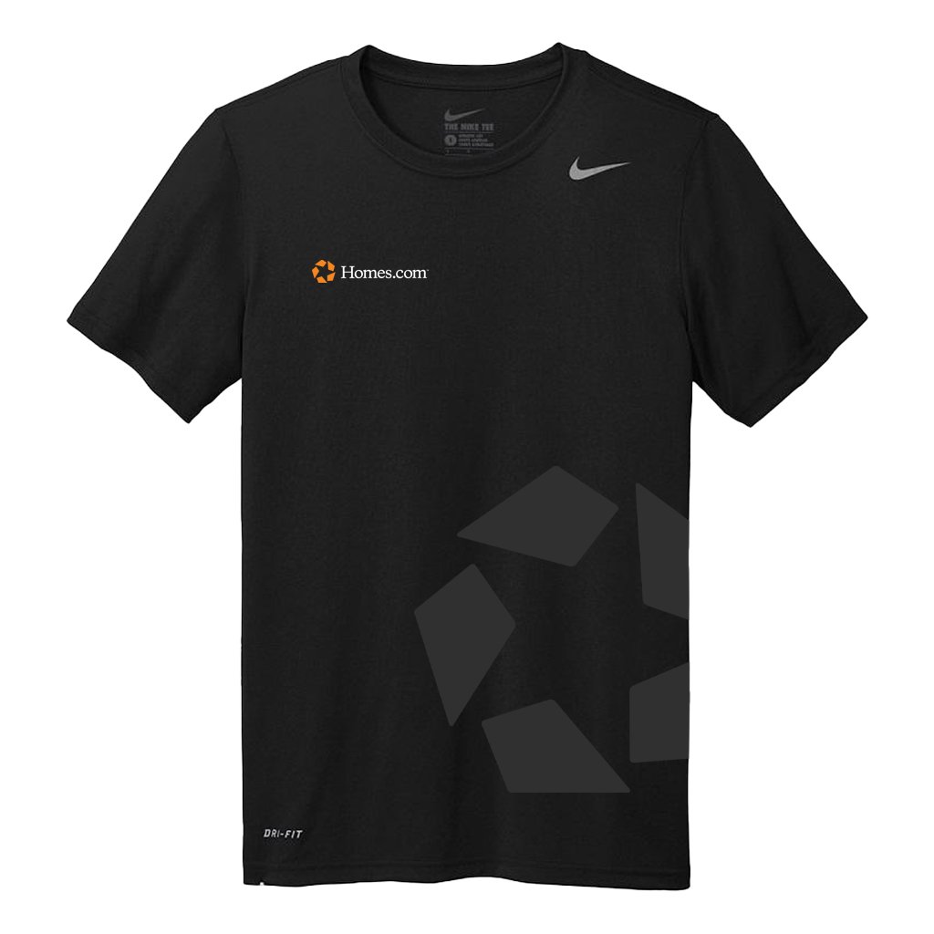
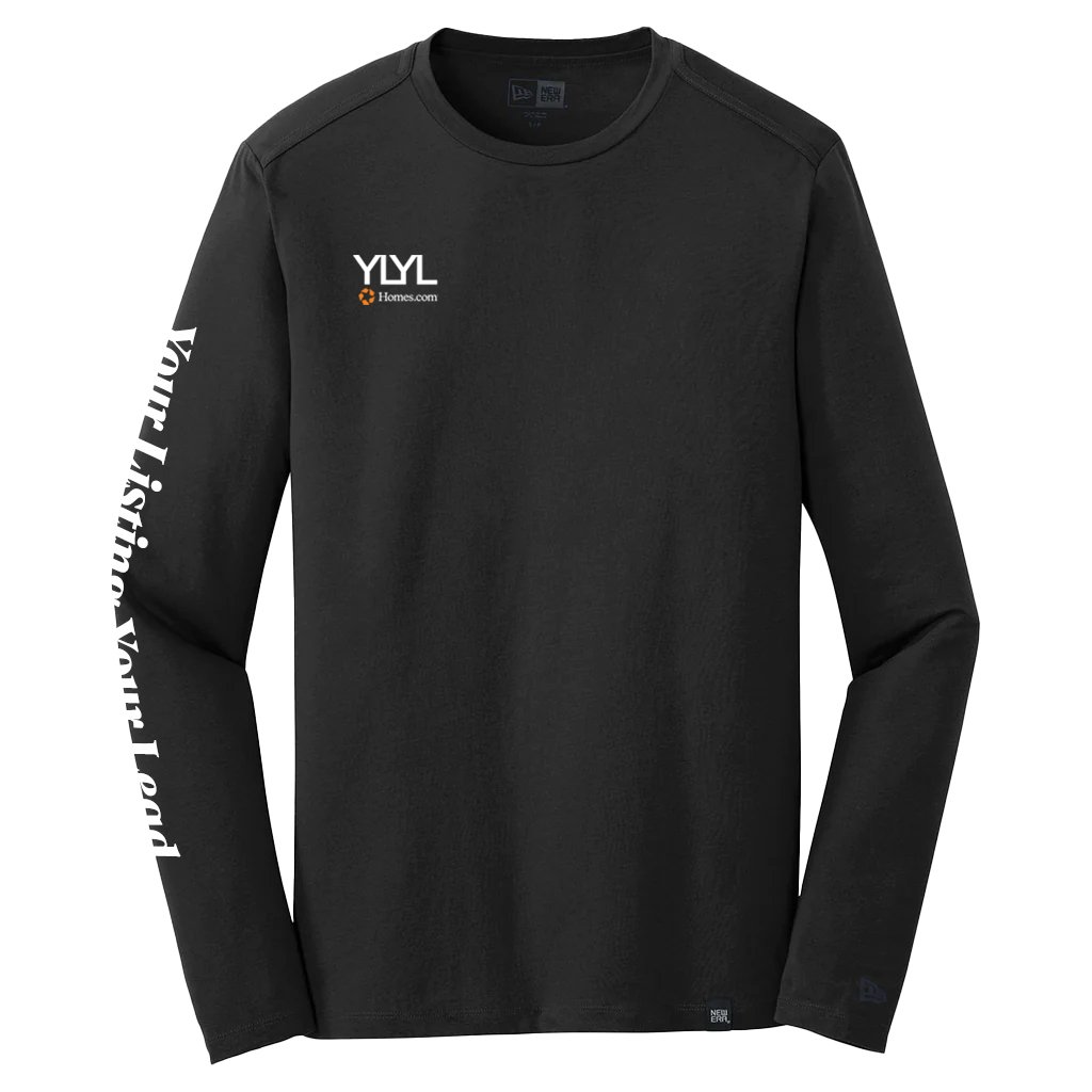
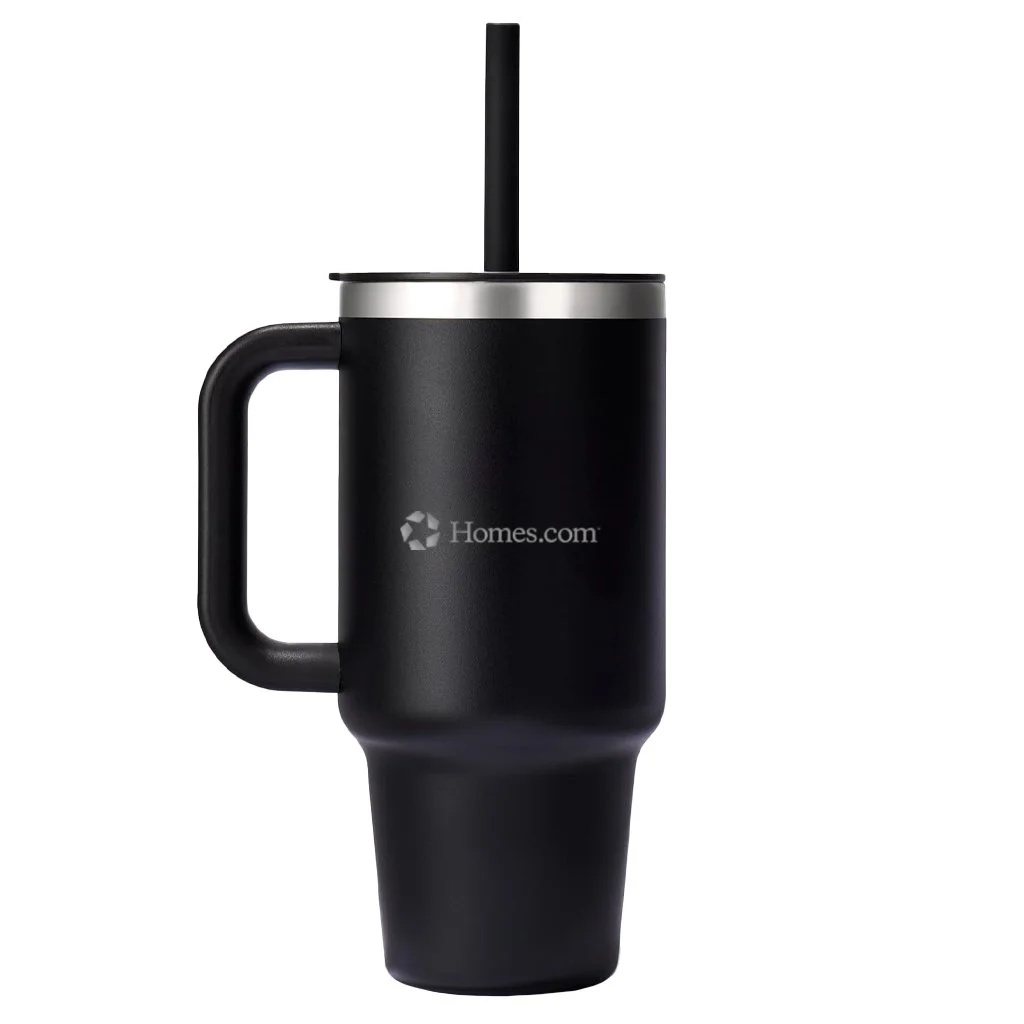
the work included: graphic design, print design, apparel design, & final mock-ups
note: this project was produced at homes.com, and is the sole property of homes.com.


