hi-impact tear tab mailer
graphic designer
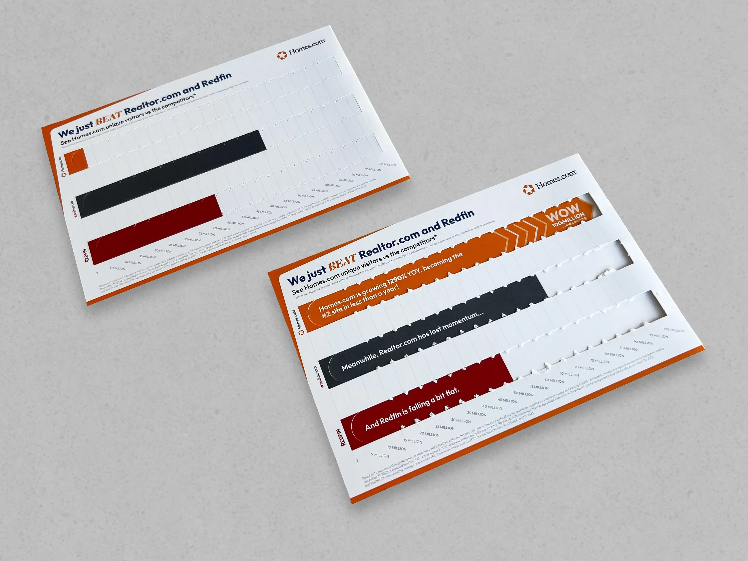
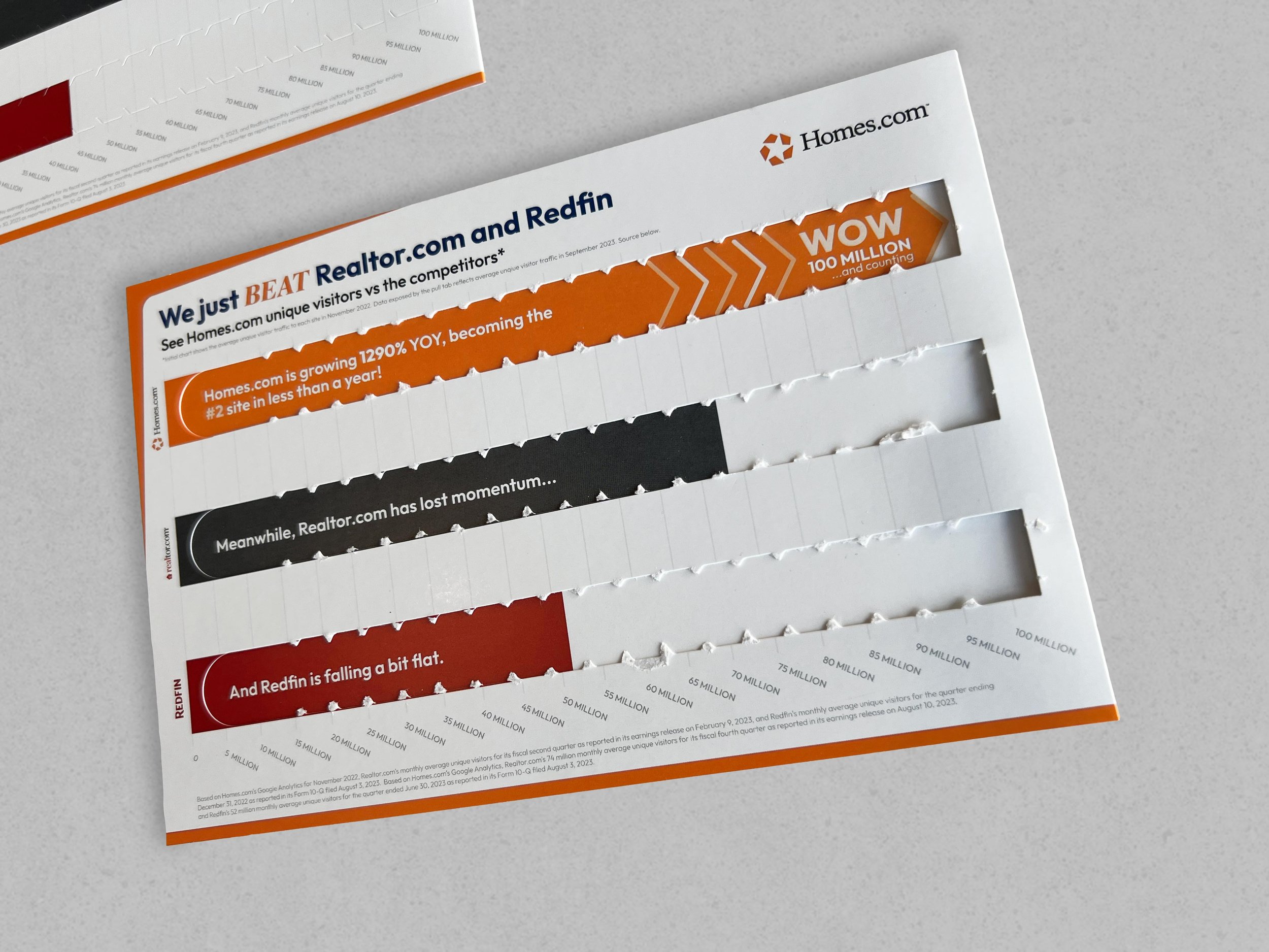
an interactive direct mailer that reveals information when the perforated tab is torn.
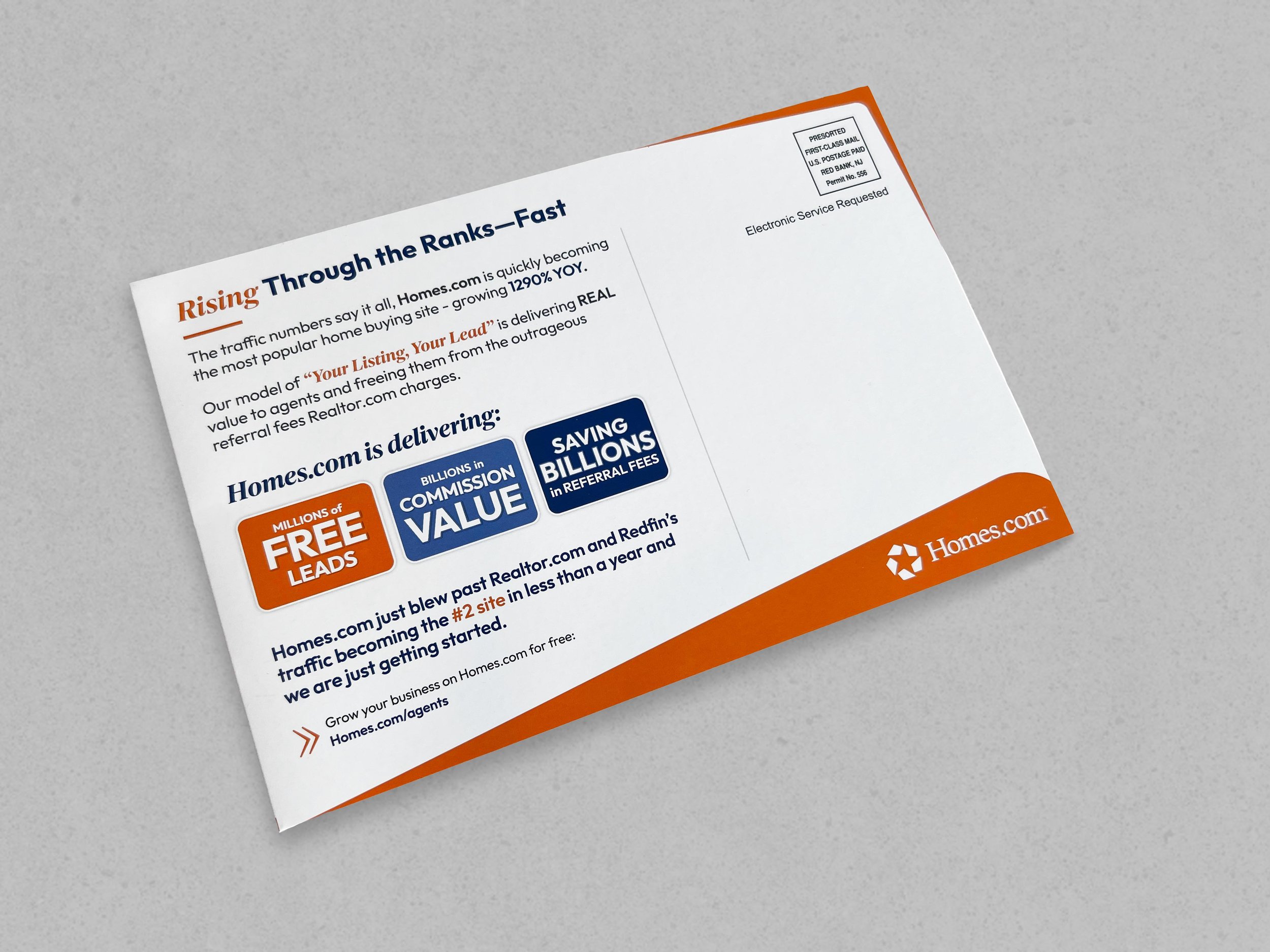
this direct mailer is a part of a larger, more extensive campaign known as the hi-impact campaign that was launched in october 2023. this campaign consists of 10 direct mailers that were sent out to agents over the course of several weeks. these direct mailers were not just ordinary sheets of paper or postcards; they were bold, well thought-out concepts, such as a balloon box, a snack box, a 5ft. press release, interactive growth charts, a lenticular, and so on.
the idea for this direct mailer arose after homes.com reached a milestone of 100 million unique visitors in a month. we wanted to showcase both homes.com and its competitor’s unique visitors for november 2022 and september 2023—essentially a before and after of their results. i thought about the concept of doing a tear tab mailer when i was trying to think about ways to show a before and after data chart that would be visually compelling and different than what most people would have seen. almost immediately i knew i wanted to create an interactive mailer as i thought that would be the most compelling and capture the before/after visual better. so, i researched for awhile, concepted ideas, thought about it, and finally it hit me—tear tab strips on cereal boxes, snack boxes, envelopes. these traditional tear tabs simply open whatever item your tearing the strip off and that’s it. but i thought, what if when you tear the tab off, it doesn’t open anything, but rather, reveals more information.
the most challenging part of this mailer was the logistical aspect of it; ensuring the “before” design and “after” design would line up perfectly when torn off for all 3 tabs. i also had to work with the supplier to create the correct size teeth for the tear tabs, which are the sharp wavy pieces on the edges. this was important because if the strips are too tight (teeth were too close together to one another) or too loose (teeth were too far apart), it could affect the ability for the tear tab to tear correctly and therefore affect the overall user experience. by understanding both the mechanical and technical aspect, it helps you to better tailor your visual design to create a more cohesive piece.
the work included: graphic design, print design, & final mock-ups
note: this project was produced at homes.com, and is the sole property of homes.com.


