homes.com social templates
graphic designer & art director
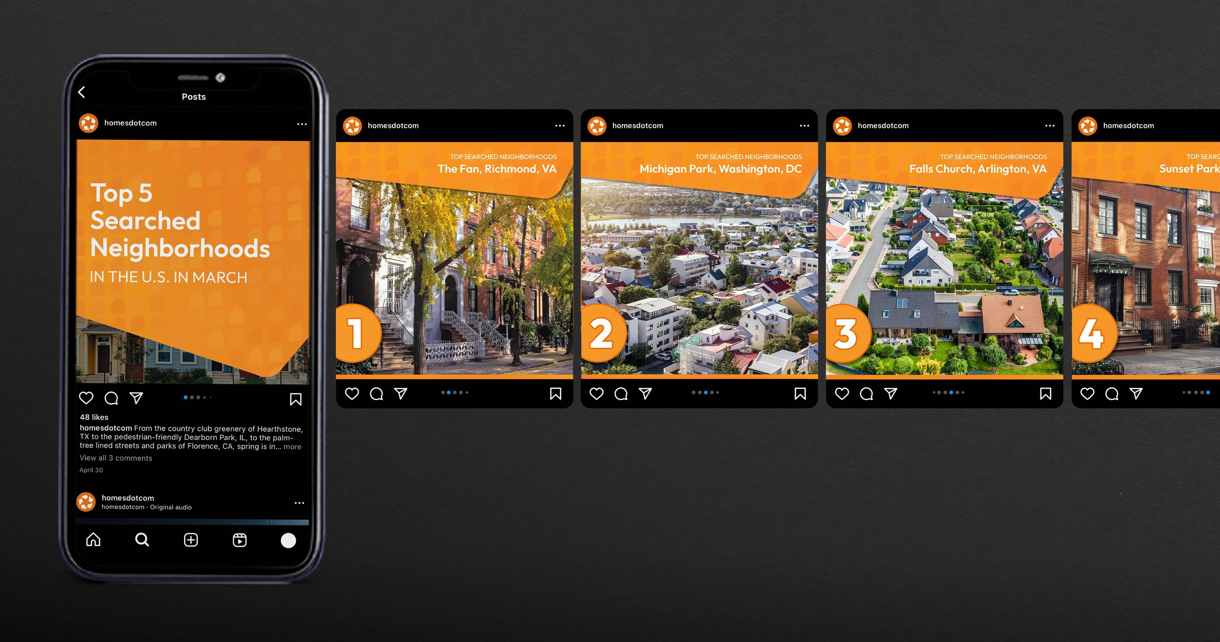
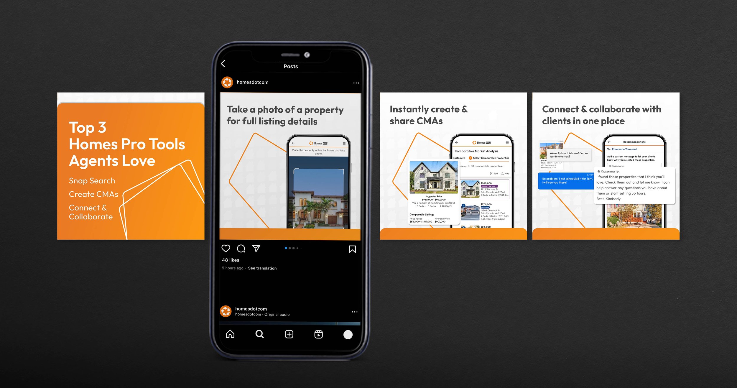
social media ads highlighting the top searched neighborhoods around the country, homes’ top tools, & more—all made via social templates.
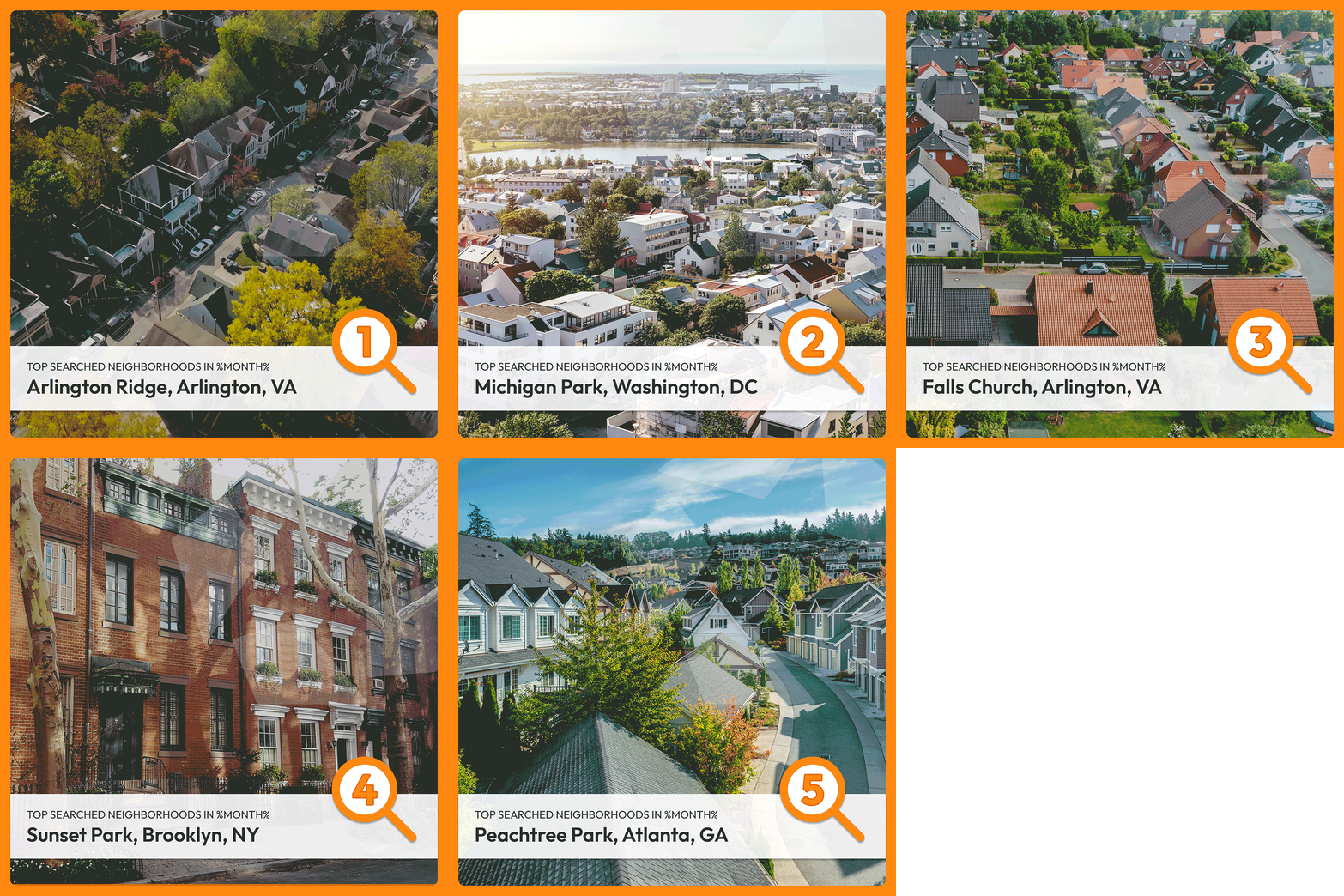
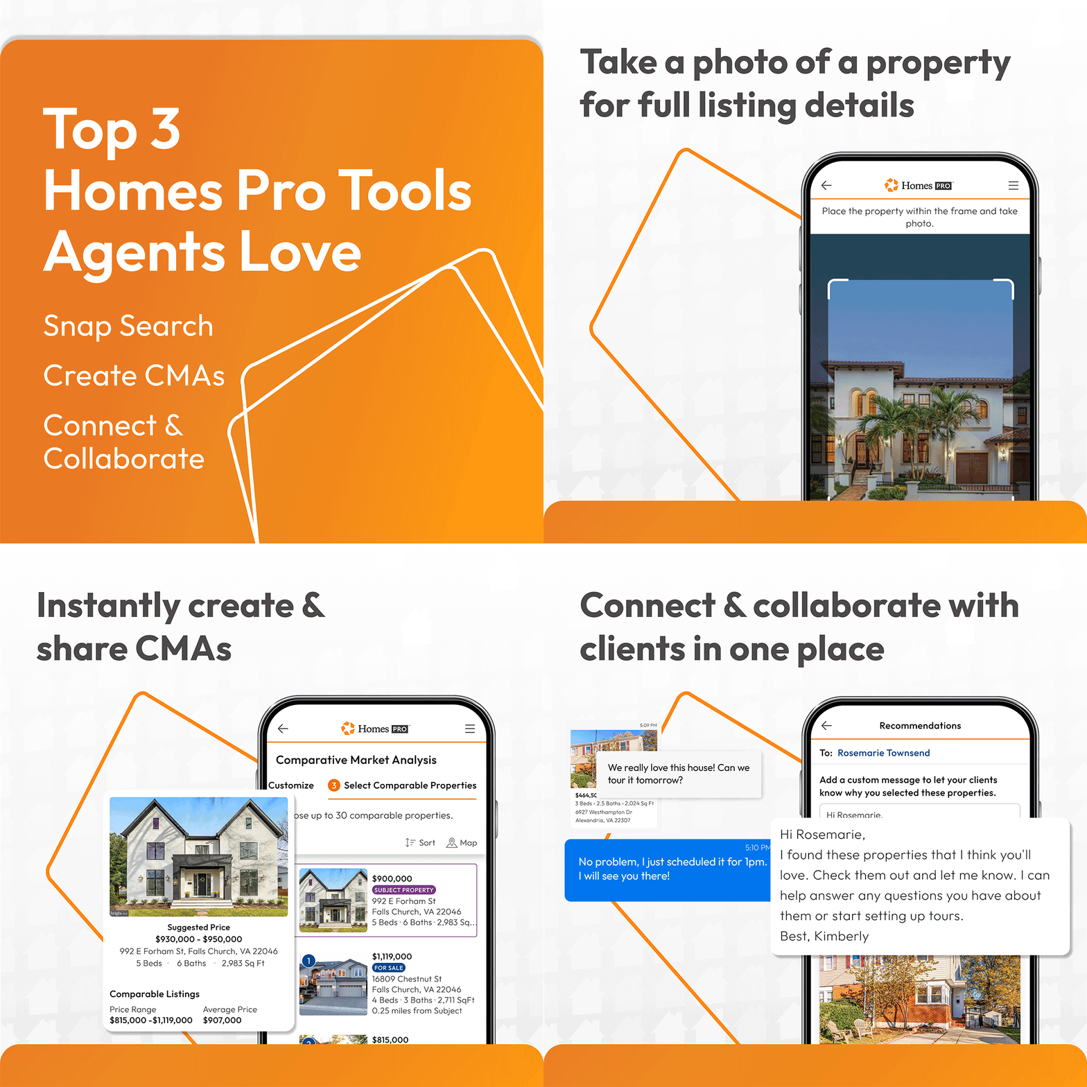
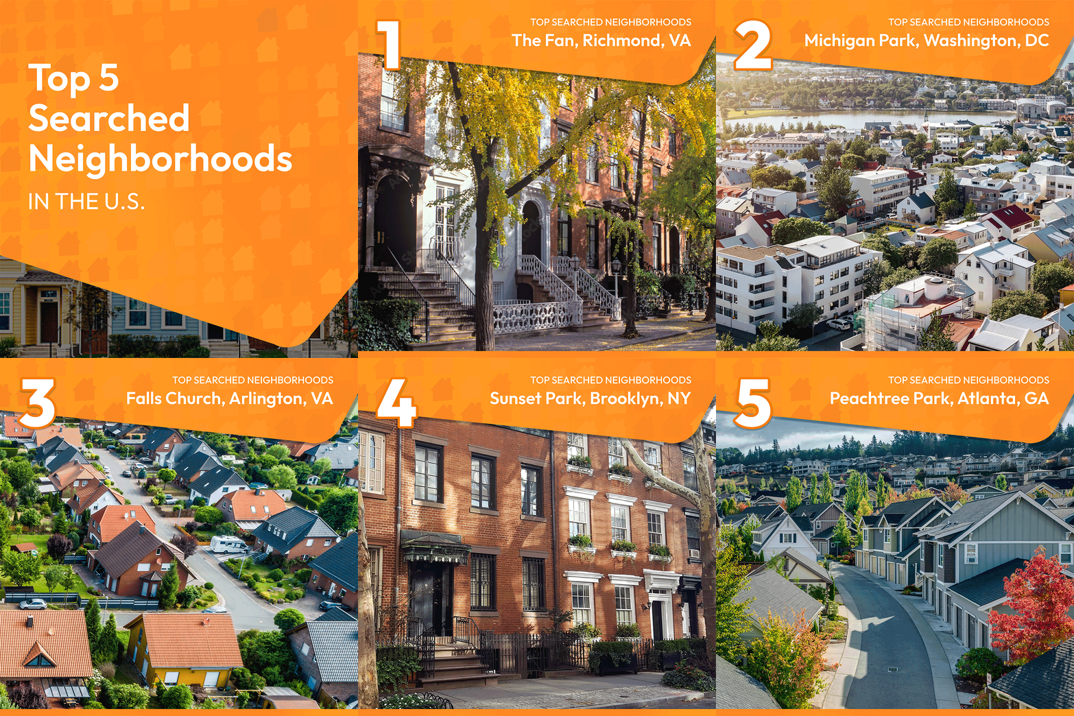
essentially, the organic social ads shown below are a small snippet of the hundreds i created over the course of this project. the first ads below were created to showcase the top 5 searched neighborhoods around the country. these would be released every month, announcing the new a-list. the second ads shown are the top homes pro tools, which also would be updated and re-posted frequently throughout the year. with every social ad we created, each platform had a tailored asset type made that best fit their needs—instagram post showcased a carousel, linkedin and x featured a gif, and instagram story highlighted a reel. by having a few different variations of the same design, it allows for each social platform to feel better catered to, rather than feeling like an afterthought, and therefore performs better digitally-speaking. the top 5 searched neighborhoods and top homes pro tool ads were just two of the many templates created amongst a much larger project i spearheaded.
to fully understand the extensiveness of this project, you need a little background context: our marketing team felt that we weren’t getting enough engagement on social media because we weren’t posting frequently enough. we also weren’t reaching the leads, exposure, interaction, or gaining enough traction. at the time, our design team was actively creating several social posts and reels, and had several other designs waiting for approval to go live, but the process wasn't moving fast enough. with this in mind, our social media manager and i worked to try to find a resolution. we finally landed on the idea of creating social templates—creating several variant designs for common types of topics we post frequently: neighborhood of the week, top searched neighborhood, testimonials, product features, and so on.
so then i began the massive undertaking of creating the social templates. i decided we needed to create 4-5 standardized designs for each of the main templates, allowing for every template to feel different and not repetitive when shown in feed. we started making lists of every topic that would be nice to post about on a routine basis and the pillars of our objective, and that became the foundation for the future templates. i was in charge of the art direction and overseeing the entire project from start to finish, so i felt that it was important for the entire design team to be included. due to that, i tried to have conversations and brainstorming sessions with them often about what we envisioned for the future of the homes’ social media since these templates would play a large role in that down the role. i ended up taking on the majority of these templates, designing them from start to finish. i also delegated a couple, or one at minimum, to each designer on the team so that they would have a physical interaction with the project, rather than only an open discussion. i really enjoyed the collaborative aspect of this project, working with various designers, working closely with the creative director, taking charge and delegating, and reviewing work along the way. it was also a fun opportunity to experiment with branding, think creatively, push the boundaries, try new things, and even redefine our brand at times. this project was a big learning opportunity for me as well, which i am immensely grateful to have been able to lead.
the entirety of the template project took roughly 6 weeks in total, and we created about 22 template topics/categories with around 200+ individual designs all together by the end. once all of the templates were approved, the idea was that it would allow us to quickly interchange data, text, and imagery within the templates to allow us to post more frequently without needing new approvals every time. this would save the entire team an abundance of time, reduce workload and resources, improve productivity, and increase our social content immensely. if i would do this project again, i would likely make a larger visual difference between paid and organic ads as they interact with different audiences and should therefore feel different yet still cohesive. the project as a whole was very successful and achieved exactly what it was set out to do. i always learned a lot as a designer, leader, and was able to explore creatively.
the work included: graphic design, art direction, animation, & final mock-ups
note: this project was produced at homes.com, and is the sole property of homes.com.

