lead messaging ads
graphic designer
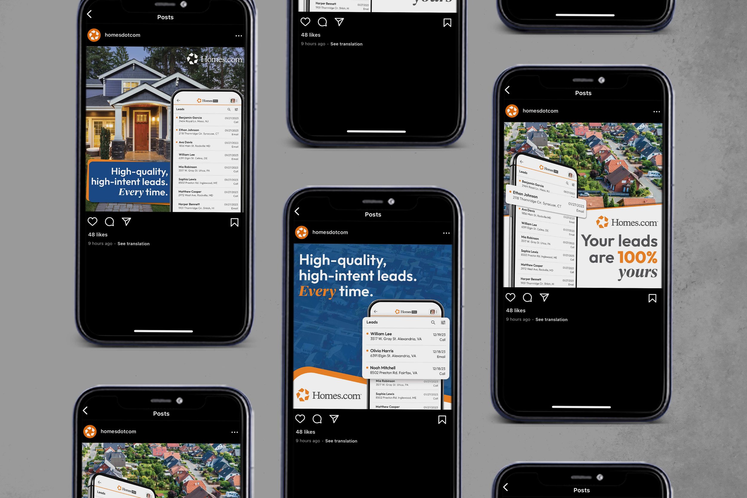
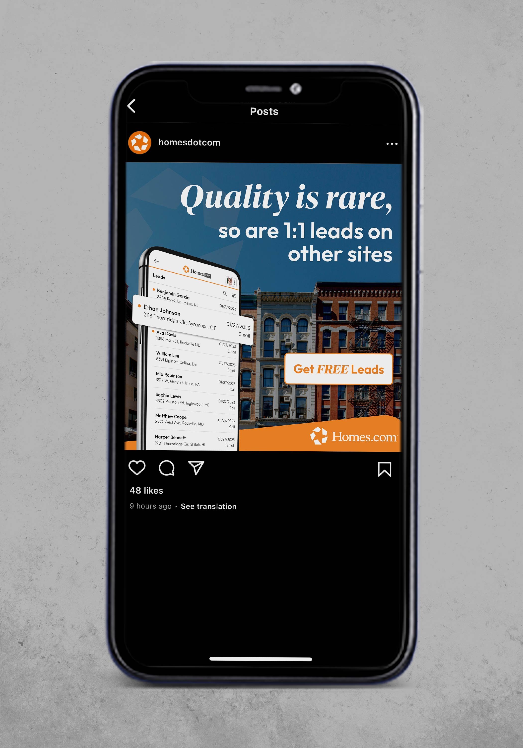
a series of ads produced based around the concept of “your listing, your lead”.
background knowledge: homes.com often says that it’s built on the principle of “your listing, your lead”, which essentially means the agent is always featured on its own listings. your leads go directly to you, and homes.com never sell your leads to other agents. as that principle is often our focus, i was tasked with creating a variety of ad designs based on lead messaging, which eventually developed into two categories: 1) your listing your lead (also known as ylyl) and 2) quality leads. both sets of ads were focused on B2B audiences.
this project was created under a tight deadline, only having a few hours to create several polished designs for the various lead-focused categories. that type of time restraint can be a pro or con, but i see it as a pro looking back at it because it allows a designer to work quickly and rely on gut instincts. throughout these ads, i was focused on a variety of factors, but most important typography, product shots, and depth. when working with small compositions that have a lot of components—heavy text, multiple or large images, product shots, contrasting colors—it can be challenging to create a design where everything fits just right. but that’s also the beauty of it. in this set of ads, i played with imagery, movement and angles, and helped to create cohesion.
the work included: graphic design & final mock-ups
note: this project was produced at homes.com, and is the sole property of homes.com.


