homes.com membership ads
graphic designer & art director
a series of carousel ads for both B2B and B2C audiences promoting homes.com’s membership.
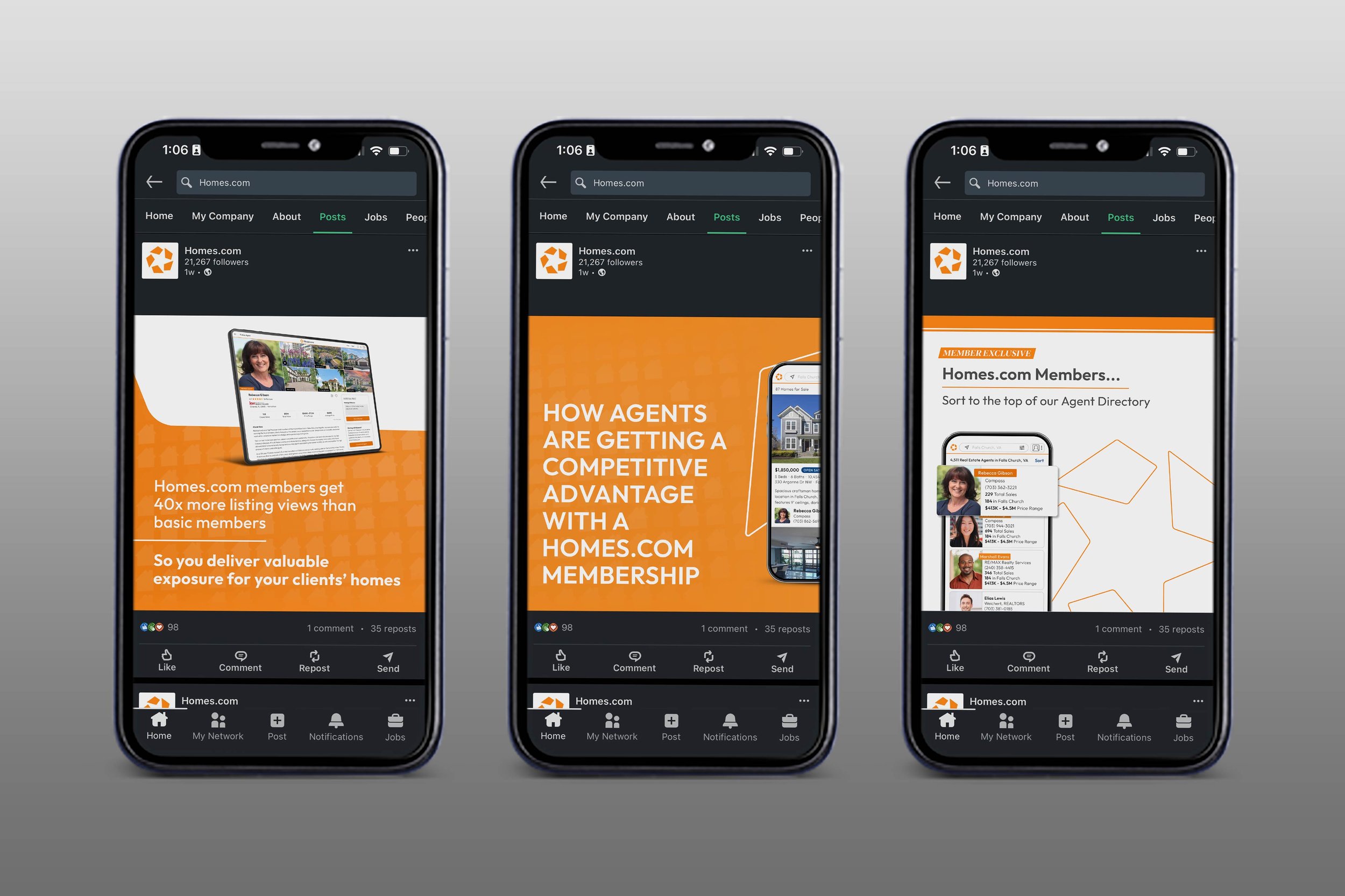
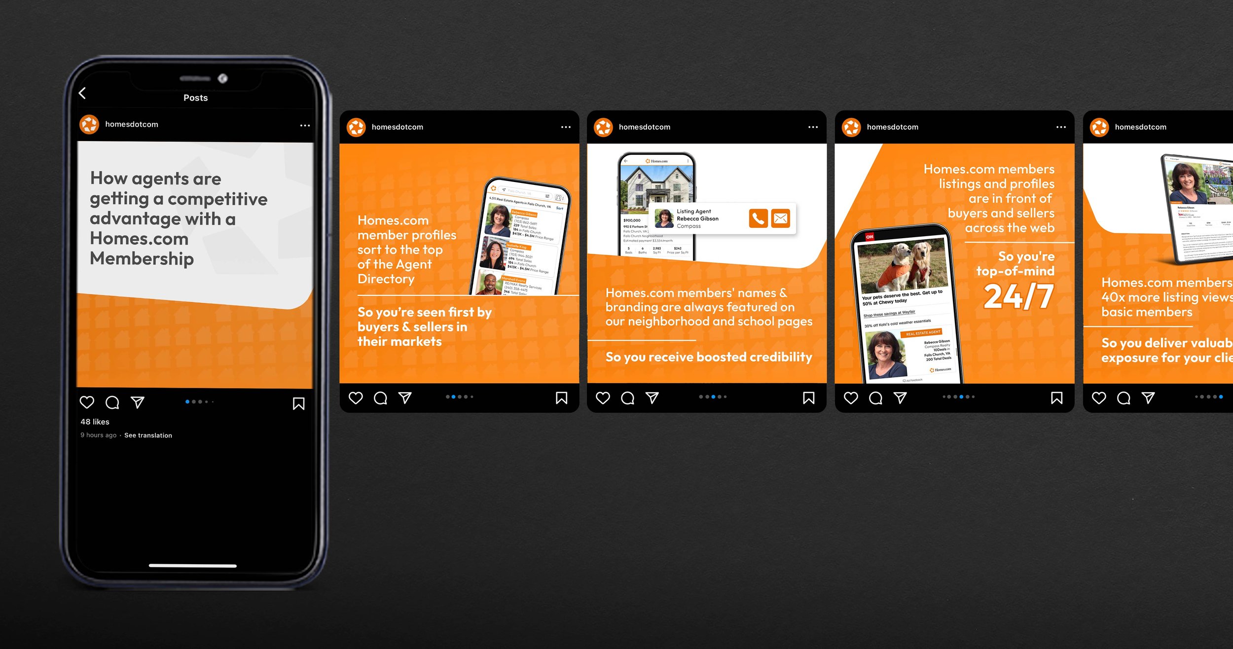
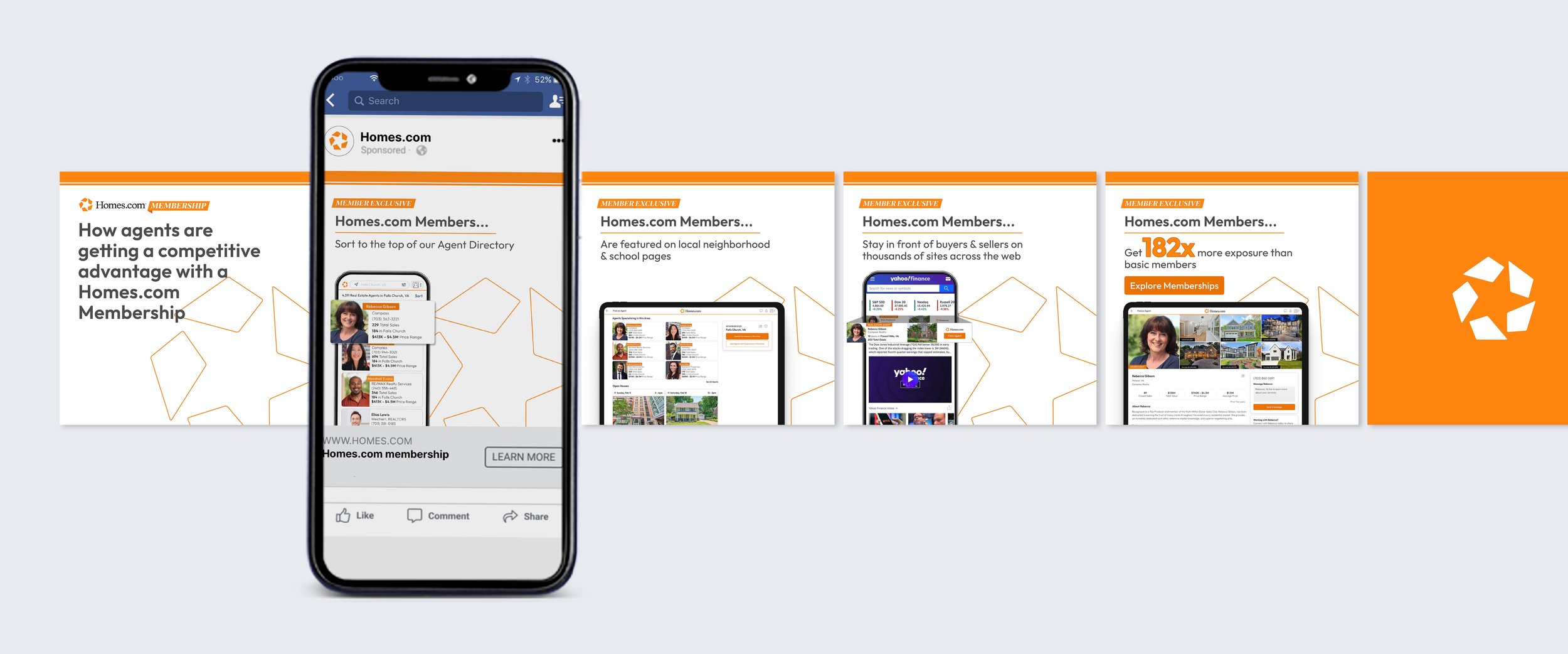
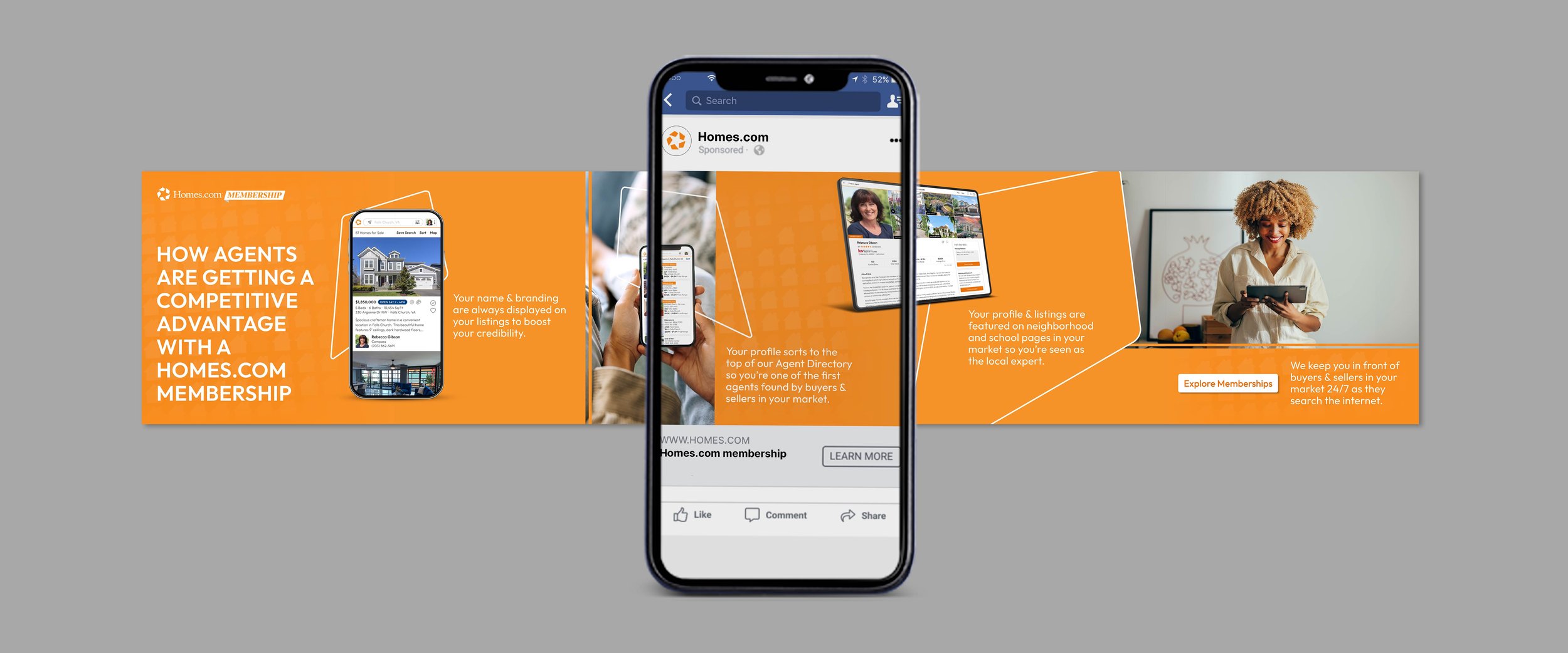
in the beginning of 2024, homes.com released the homes.com membership, thus creating a need for a large number or assets and deliverables that promoted, educated, and featured its existence. these membership ads were created into 3 designs, each being a carousel and each being converted into both organic and paid ads.
this project came with many opportunities for exploration as homes.com began refreshing its branding earlier in 2024, creating more modern and sleek designs. all 3 of the ad designs created were made into carousels due to the extensive copy needed to explain the product features and highlight the homes.com membership. throughout the process, i worked to find new ways to expand the carousel boundaries, not wanting the ads to feel repetitive or flat. working with another designer, ad 2 features a seamless carousel design that carries its design and message flawlessly from beginning to end. it was important to me when animating this ad to continue breaking the mold, so i decided to pan the ad from left to right creating a sliding video feel. i also worked to make sure all of the designs felt both clean and engaging. i did this by paying close attention to the details, adding textural elements, and focusing on typography and visual movement. this project was a big stepping stone for our marketing team at the time due to the fact that it utilized several elements of the new branding style that we were pivoting towards, it explored new ways to showcase ads and increase engagement, and it was a successful use of the social templates that i had been working on for several weeks prior. on the contrary, if i would do this project again, i would make the paid and organic ads visually different as they interact with different audiences, exist on different platforms, and should therefore feel cohesive but very different. i feel that organic social is the perfect opportunity to explore, push boundaries, and try new things to see what audiences engage with. whereas paid ads should feel more clean and thought-out since it usually is calling the end-user to do something, and should therefore feel legit.
the work included: graphic design, art direction, animation, & final mock-ups
note: this project was produced at homes.com, and is the sole property of homes.com.


