homes.com membership brochure
graphic designer
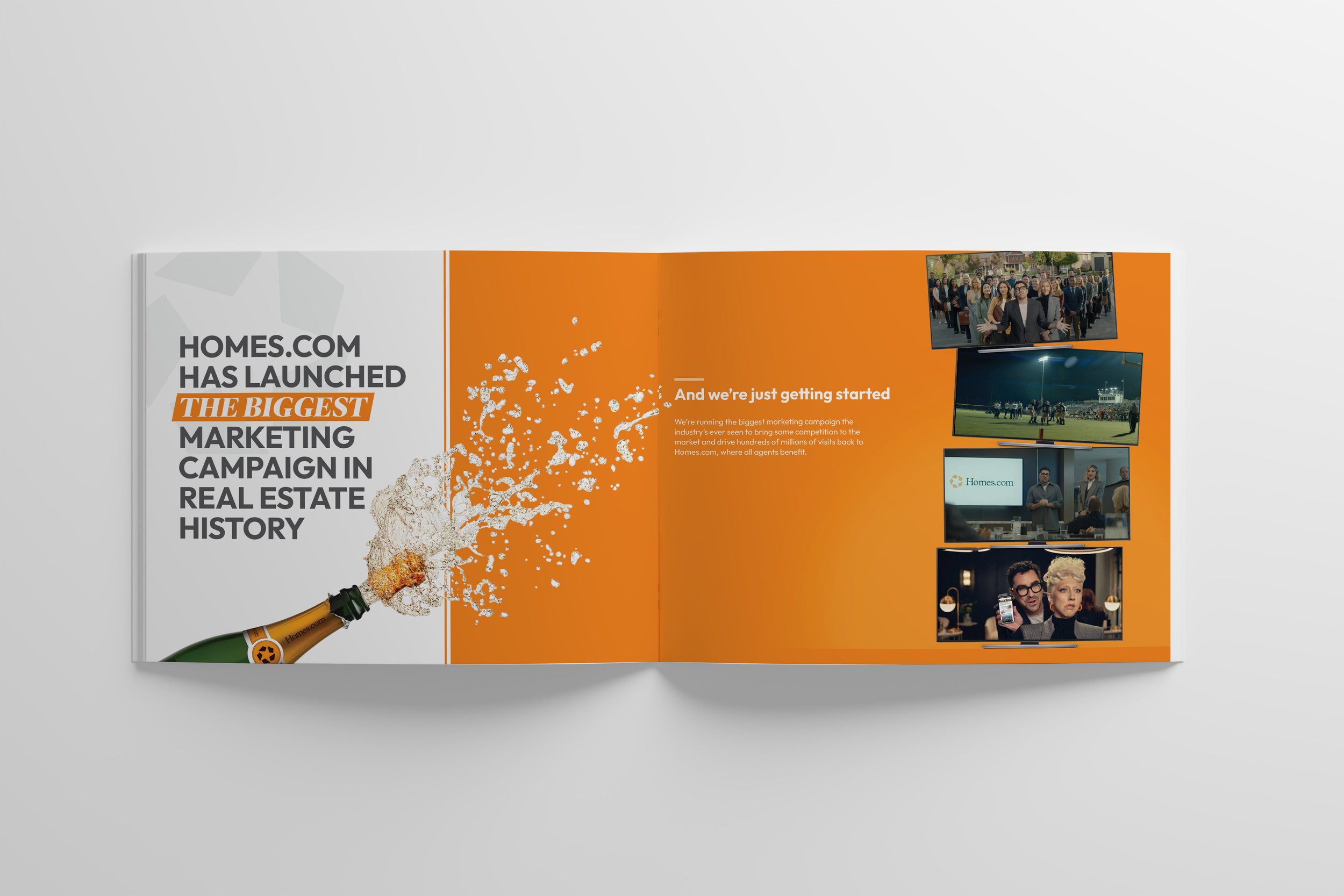
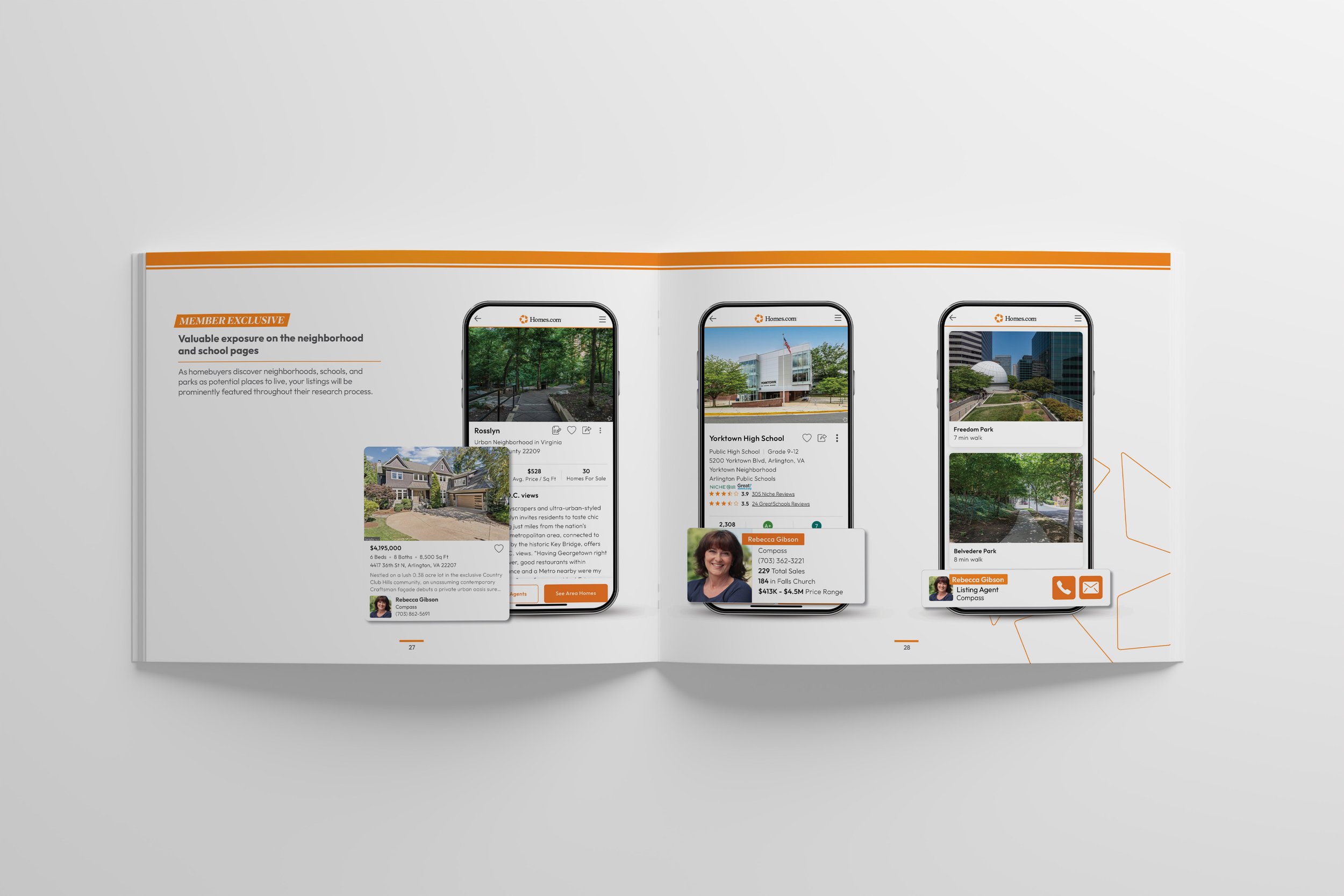
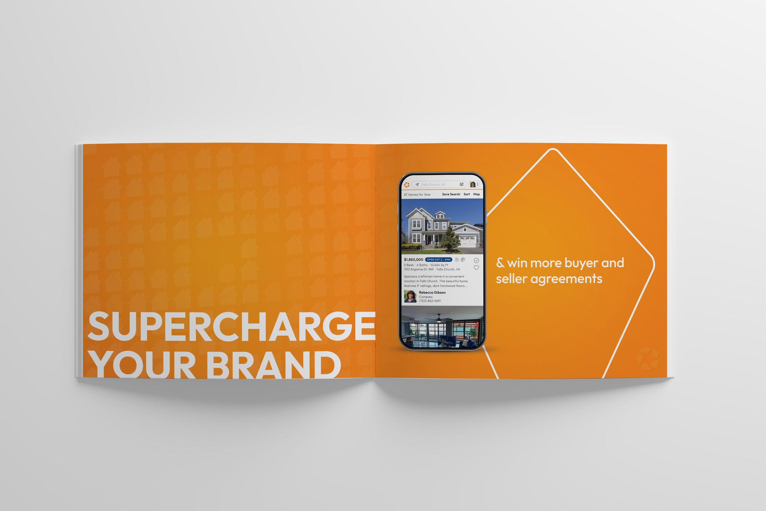
a 36-page brochure showcasing product features and highlighting the benefits to homes.com’s membership.
this project features a 36-page saddle stitch brochure that is focused around clean, yet eye-catching design.
i worked as the sole designer on this project, working to try to redefine the brand’s identity for a new and evolving company. the intent was the create a space that allowed the product to speak for itself and give room for the features to emphasize their importance. this brochure also showcased the new homes.com membership, so i worked to create a gradient visual accent that felt more elevated for the membership exclusive pages. overall, this project posed as both exciting and challenging as i worked to create design systems throughout the brochure, ensuring that all the pages and content felt cohesive. there was several of opportunities for exploration, such as the orange stroke pinwheel you’ll see on some pages, which is the homes.com icon. once the project was complete, this brochure served as the “design bible” for our design team as we worked to continue developing the growing brand guidelines.
the work included: graphic design, print design, & final mock-ups
note: this project was produced at homes.com, and is the sole property of homes.com.


