nar campaign event
graphic designer & art director
a complete campaign for homes.com’s 2023 nar attendance—booth design, ads, emails, merchandise, and print designs.
nar stands for the national association of realtors, which is the biggest association in the country. every year they have a conference, and 2023’s conference was the biggest one yet for homes.com. it was our announcement that we’re on the fast track to becoming one of the top competitors in the real estate game.
during this campaign, i spearheaded the project from start to finish, working on the overall booth design, emails, signage, ads, and more. i also worked alongside the creative director to come up with the art direction for the campaign, and then single handedly carried that narrative across the various platforms and deliverables.
the first thing i worked on was the email designs—these were split up into three categories: pre-event, during the event, and post-event emails. we split the emails up into these waves so that the recipients would receive smaller amounts of information about the event more frequently, being more inclined to visit our booth. this period of time was crucial to figure out the exact copy, art direction, and imagery for the event. it also was critical for the marketing team to determine what our booth would look like, what giveaway we would feature, and what interactive elements we would have. i then began working on the booth design, which is when the creative design became crucial. our nar booth consisted of: floor clings, table cloths, 3d cubes, banners, escalator graphics, column wraps, bus shuttle graphics, and more. the biggest design choice i wanted to instill in all of these deliverables was our orange brand color. it was also important to emphasize homes.com reaching 100 million unique visitors, our booth location at the event, and our theme: game on! throughout this process, the biggest challenge was designing on such a large scale. when designing for events and exhibits, people need to see your graphics from far away and need to understand the overall concept very quickly. it was also tricky due to the amount of copy i was required to put on some of the smaller signage, which made this project a fun problem-solving dance. my favorite pieces from this event were the 3d cube, column wraps, bus shuttle, and escalator median graphic.
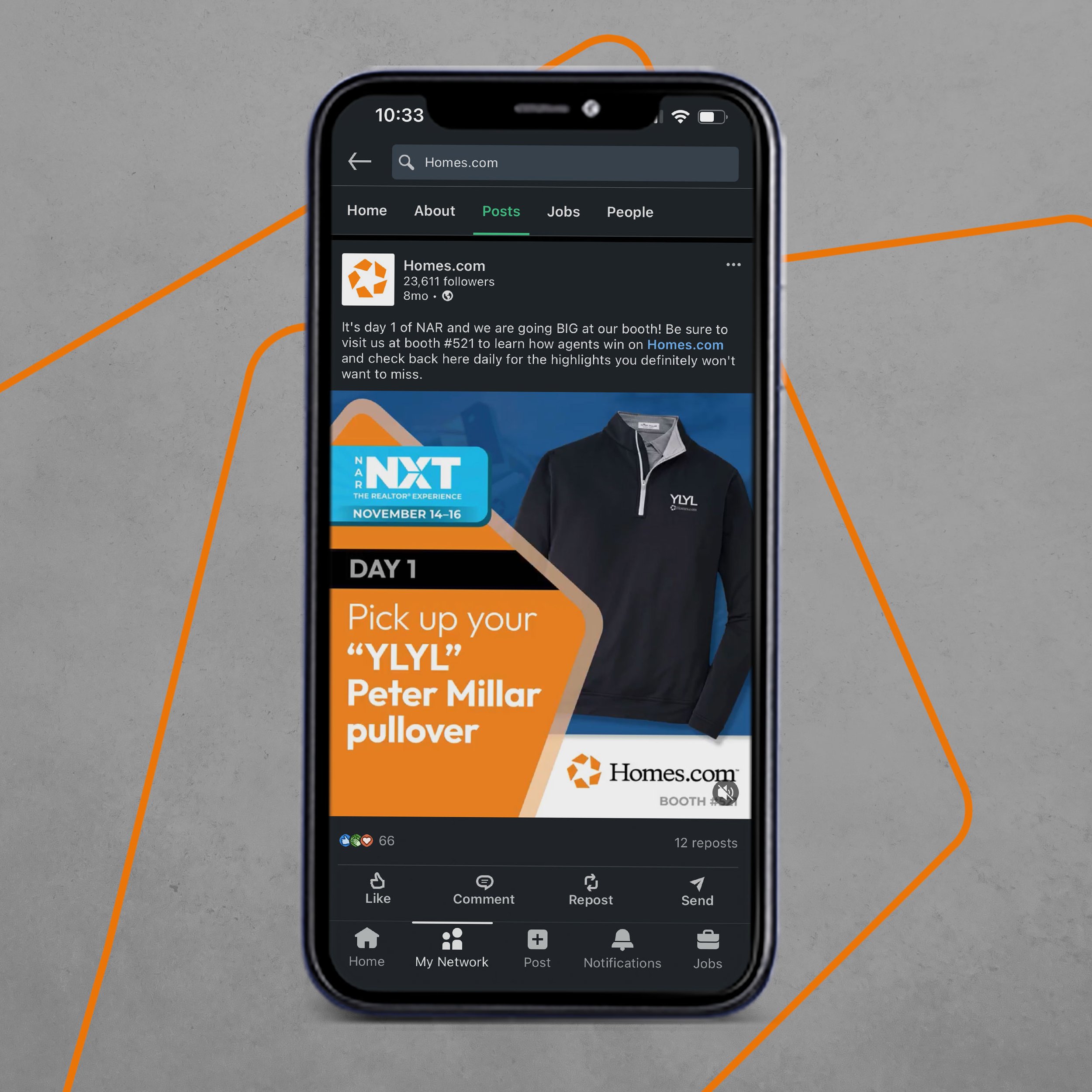
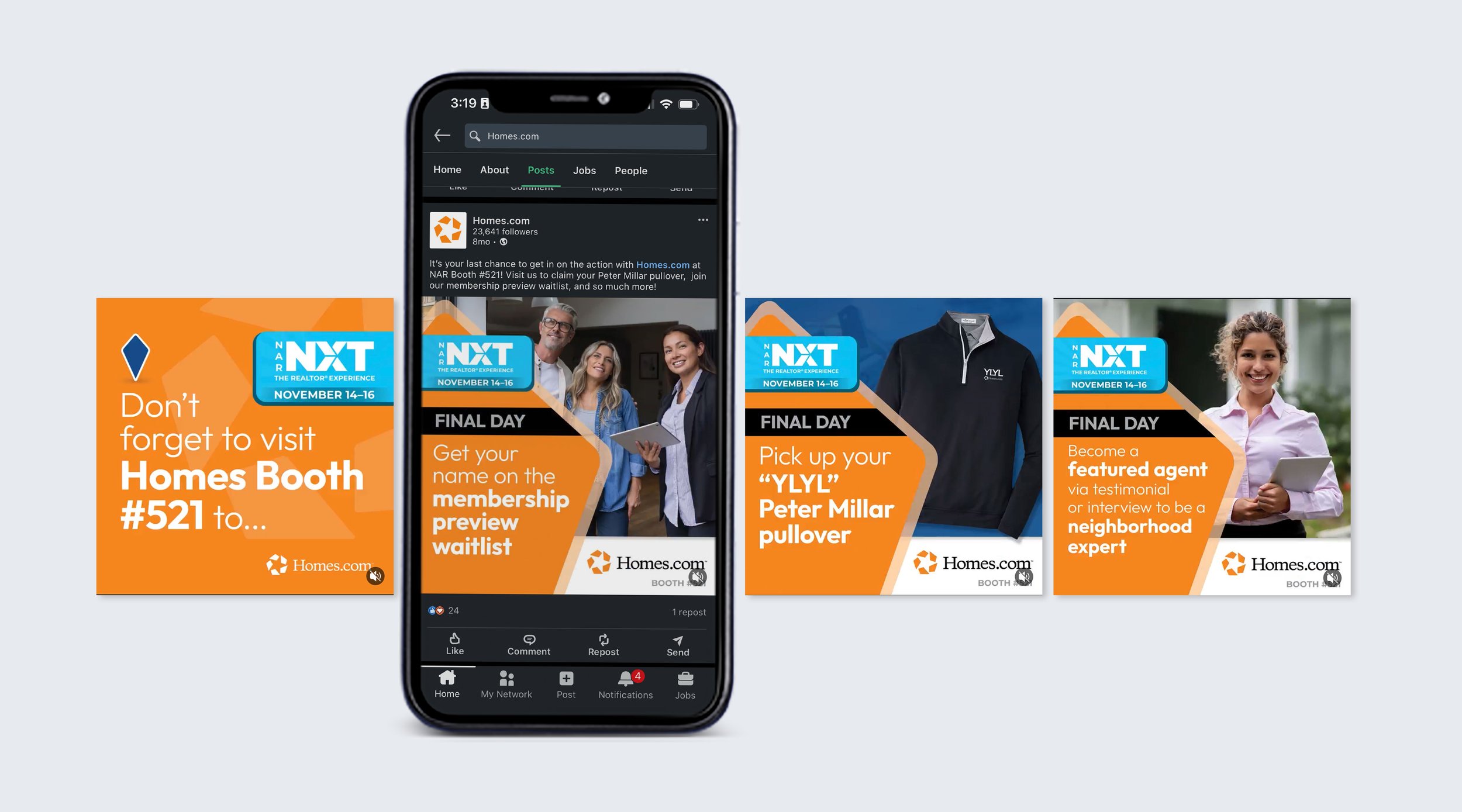
i also designed various other signage for the event that was needed last minute, such as table top signage. the night before the event started, the team that was setting up the event came up with the idea of having an coffee table, which meant they needed fun signage to go with it. creating the table top signage for the event was one of the more fun tasks to do as i was able to be really creative with it. i also designed ads to highlight various aspects of our booth, such as the learning lounge, free swag, interviews, and more. all in all it was truly so incredible to see my work on a large scale such as this one.
the work included: graphic design, art direction, print design, digital design, exhibition design, & final mock-ups
note: this project was produced at homes.com, and is the sole property of homes.com.


