the garden storefront
graphic designer, ui/ux designer
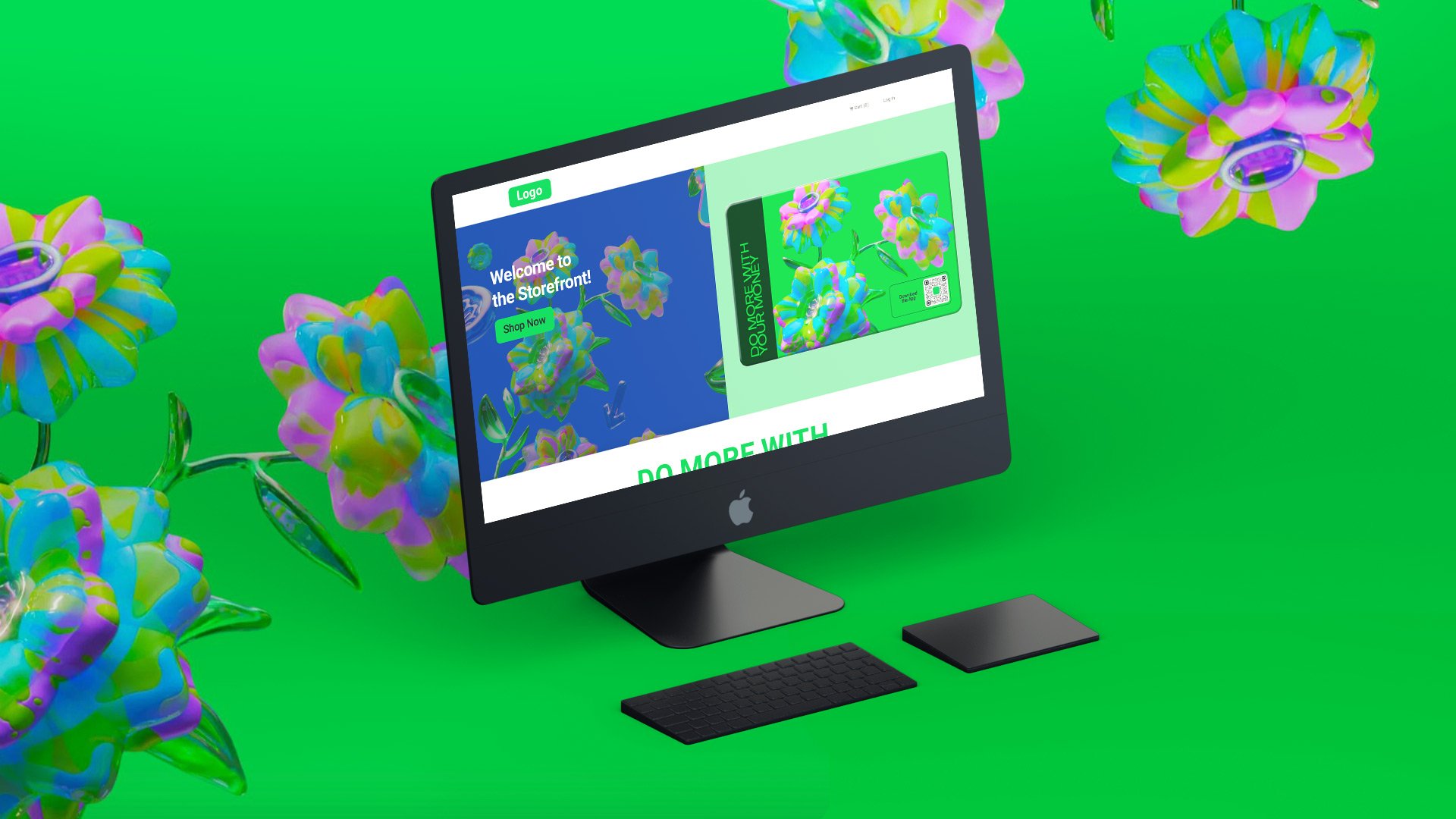
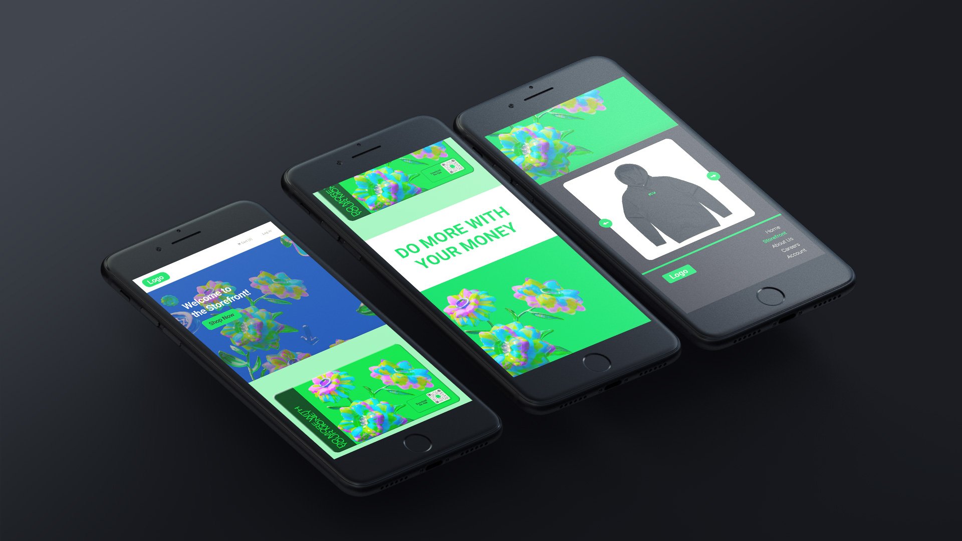
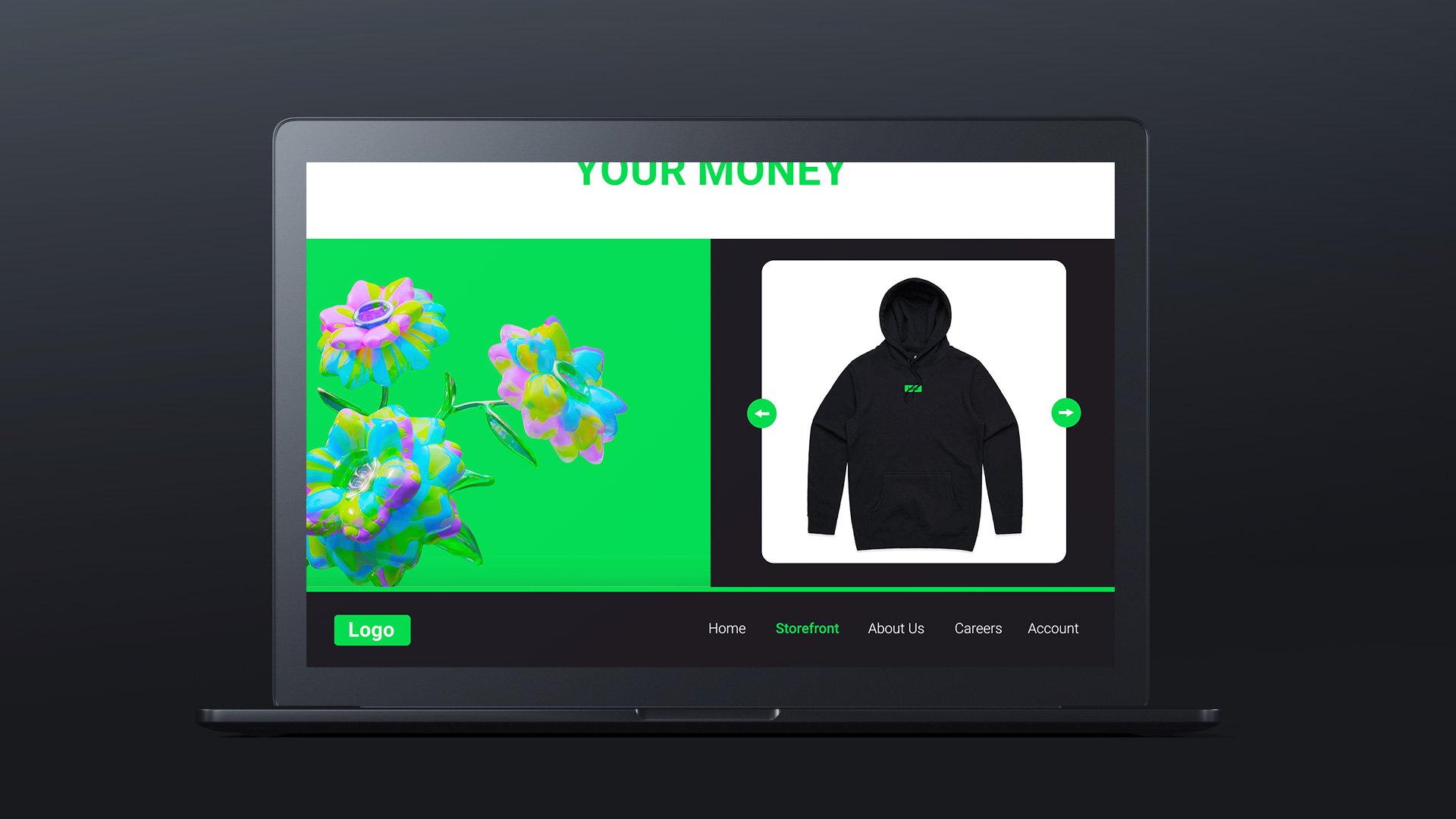
a storefront website for a transaction company, featuring custom merchandise.
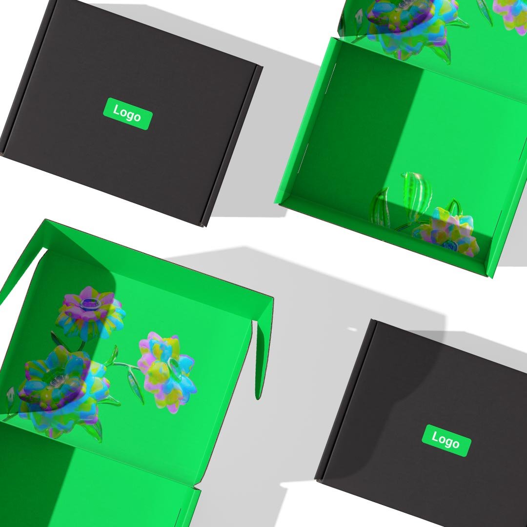
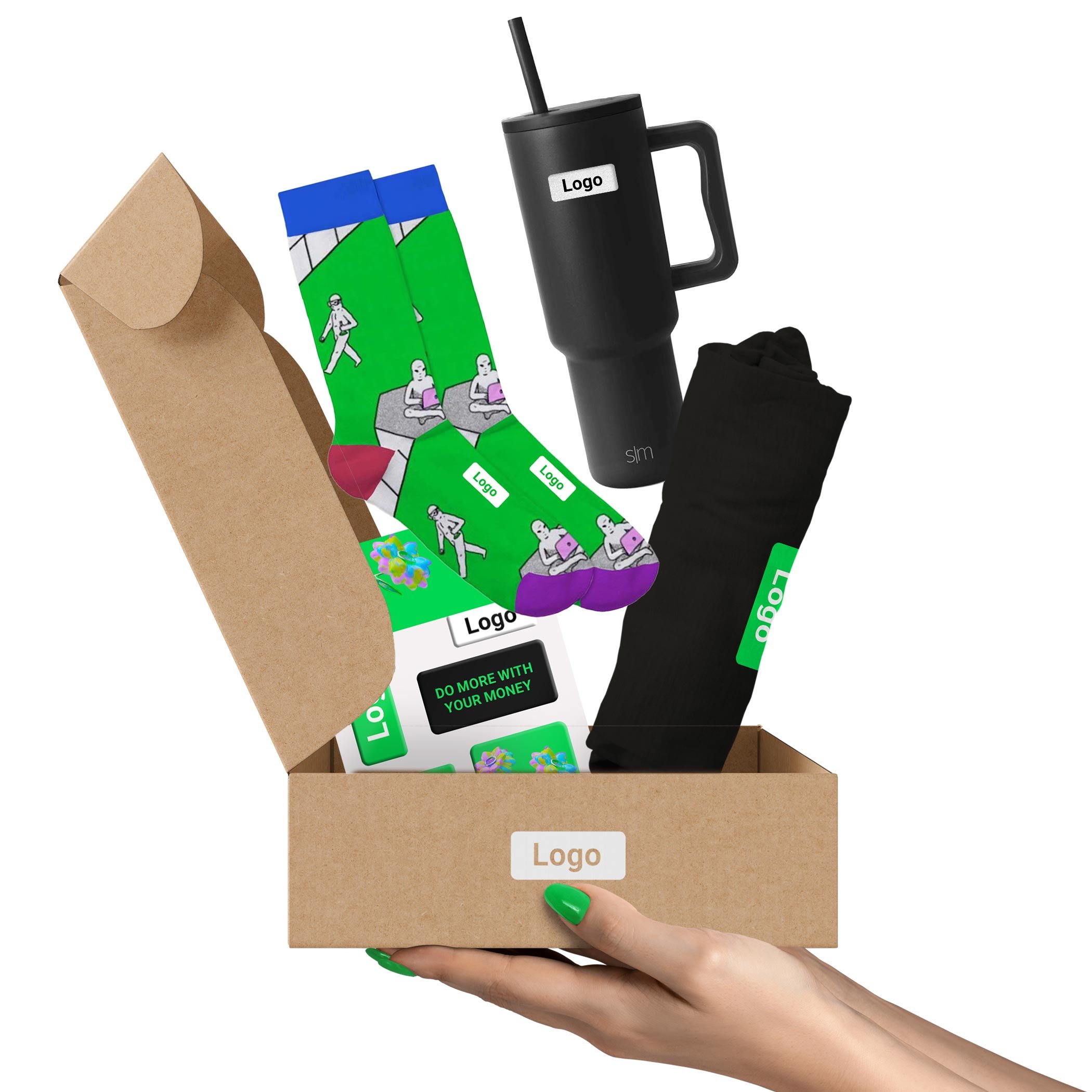
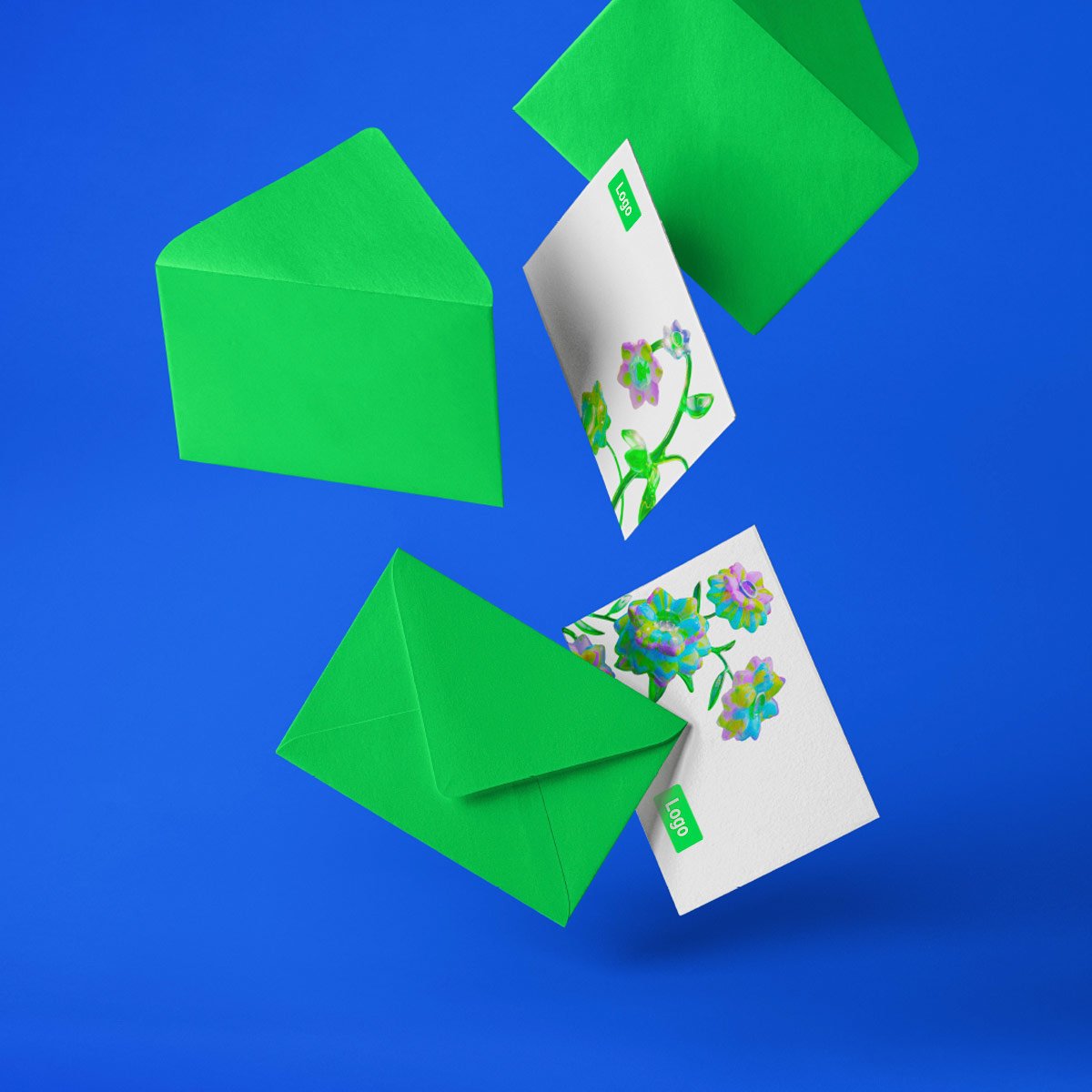
this storefront showcases bright, bold colors and fun nature imagery. the imagery shown throughout the designs are striking as they are plant- and nature-inspired, yet are heavily edited to appear ai-generated and technology-oriented. due to that, i wanted to use bright colors that resembled colors found in nature, but that were overly saturated to mimic the same technological feeling as the patterns in the design do. this client is nda-protected, and therefore their logo cannot be shared.
my main goal while working on this project was to create a storefront that felt user-friendly, interactive, and bold. i wanted to feature products throughout the homepage so users would be able to quickly see their options. it was important to me to combine both product imagery and information about the client brand, so that the storefront had dual functionality. i thought it was also dire to include moments of neutral tones or blank space throughout, in order to give the eye and user a break from the bold colors. this project focused heavily on branded merchandise, such as socks, drinkware, apparel, gift cards, stickers, and stationary. i also worked on a presentation deck for this client, showcasing the variety of options, customizations, and products, as well as pricing and steps that come with partnering with brilliant. my goal throughout this project was the create a series of designs, web pages, products, and example mock-ups that were cohesive, bold, and fun.
the work included: ideation, graphic design, packaging design, web design, & final mock-ups
note: the real client for this project is nda-protected. out of respect for an existing privacy contract, the client’s name and content copy has been erased.
