u-direct storefront
graphic designer, ui/ux designer
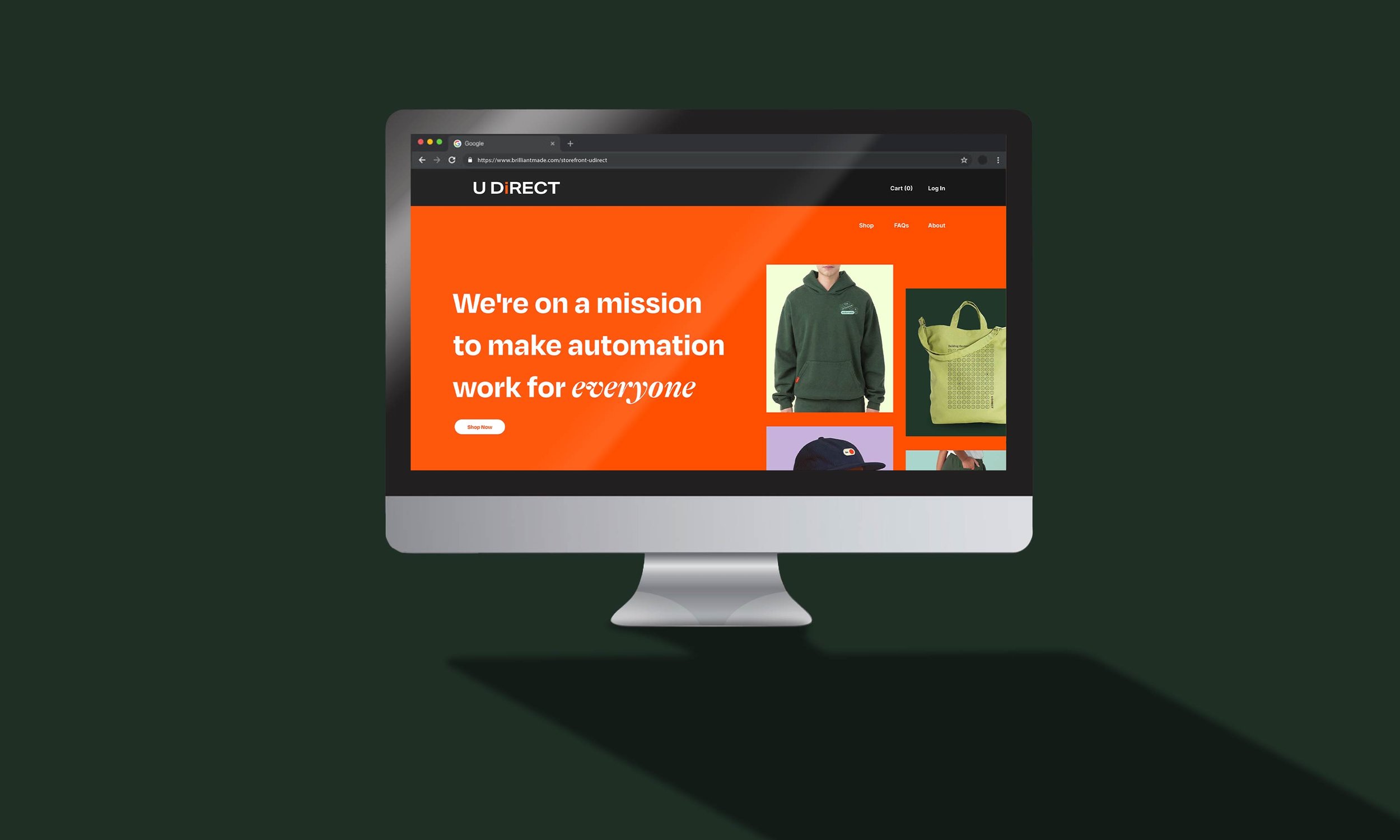
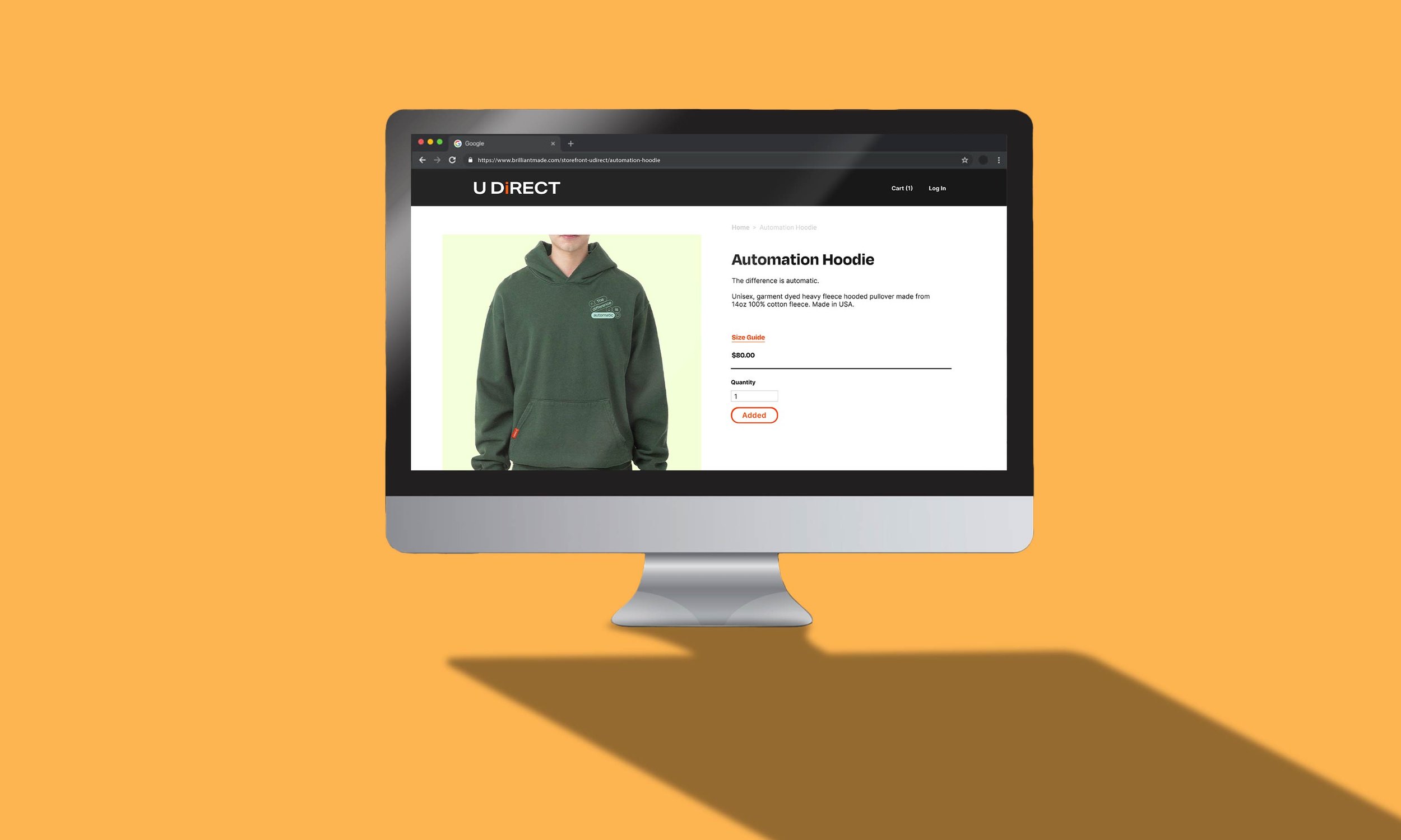
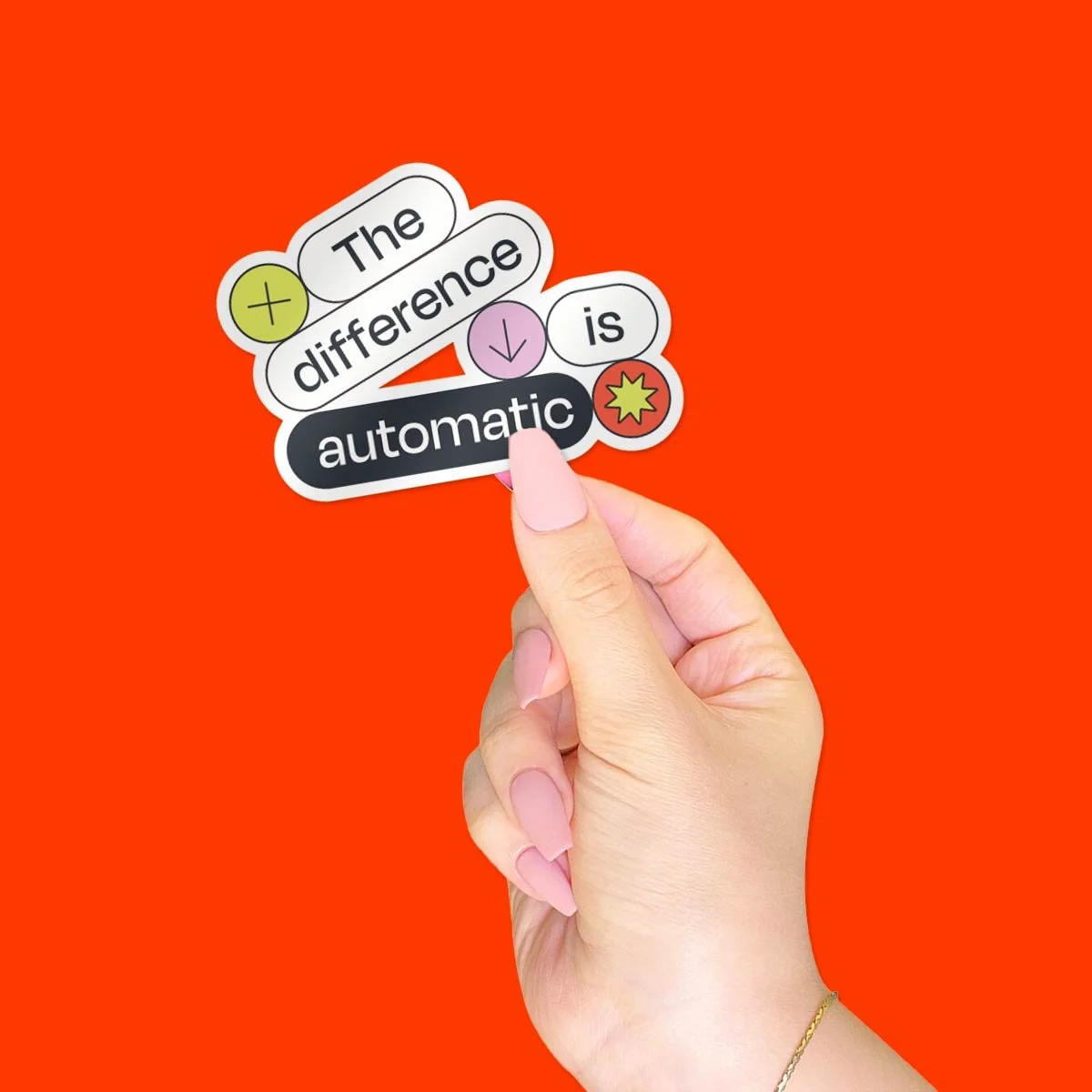
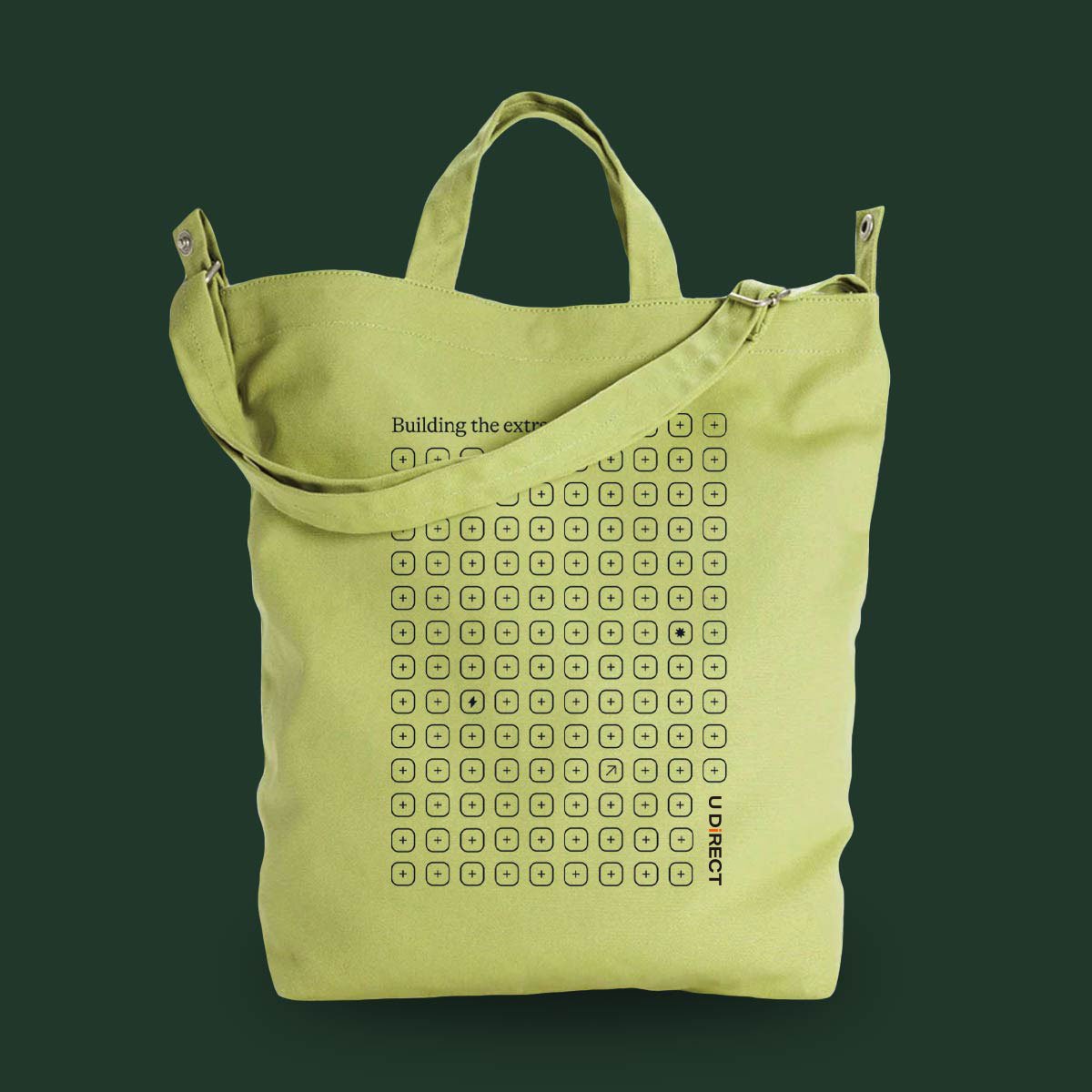
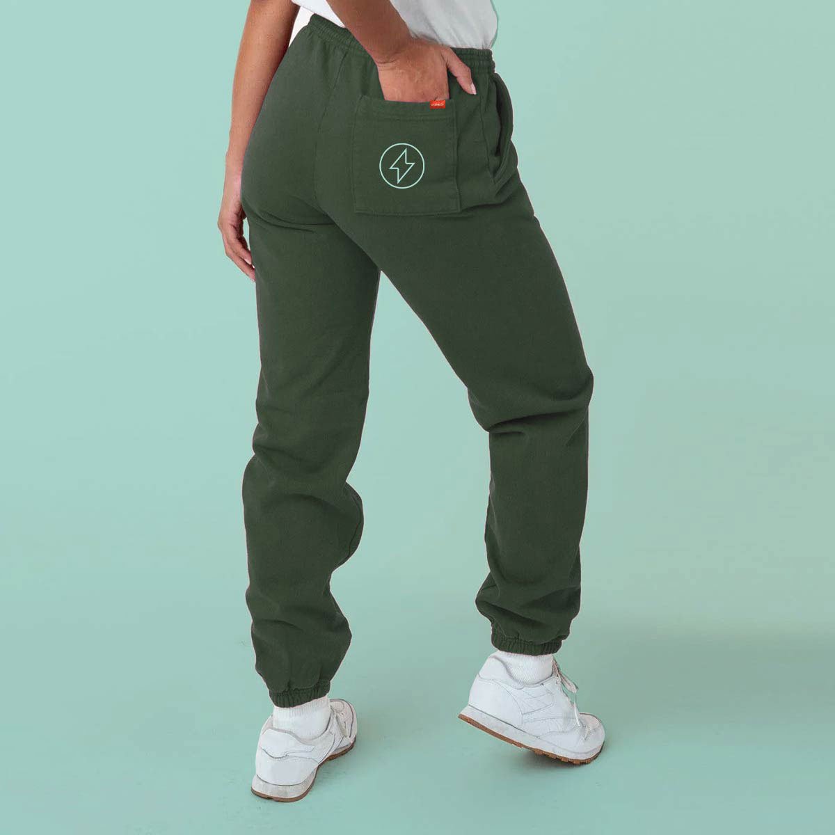
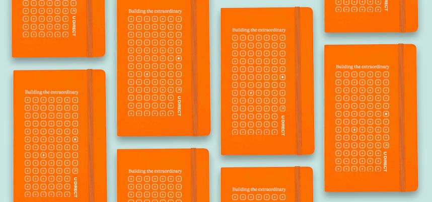
an e-commerce website for a premium client, featuring a collection of branded merchandise.
this storefront site and collection of products were created while working as a graphic designer at brilliant. please note, the client in this project is nda-protected. therefore, the final designs shown in this project have been altered—such as a placeholder company name and (some) alternative copy—in order to protect and respect their identity.
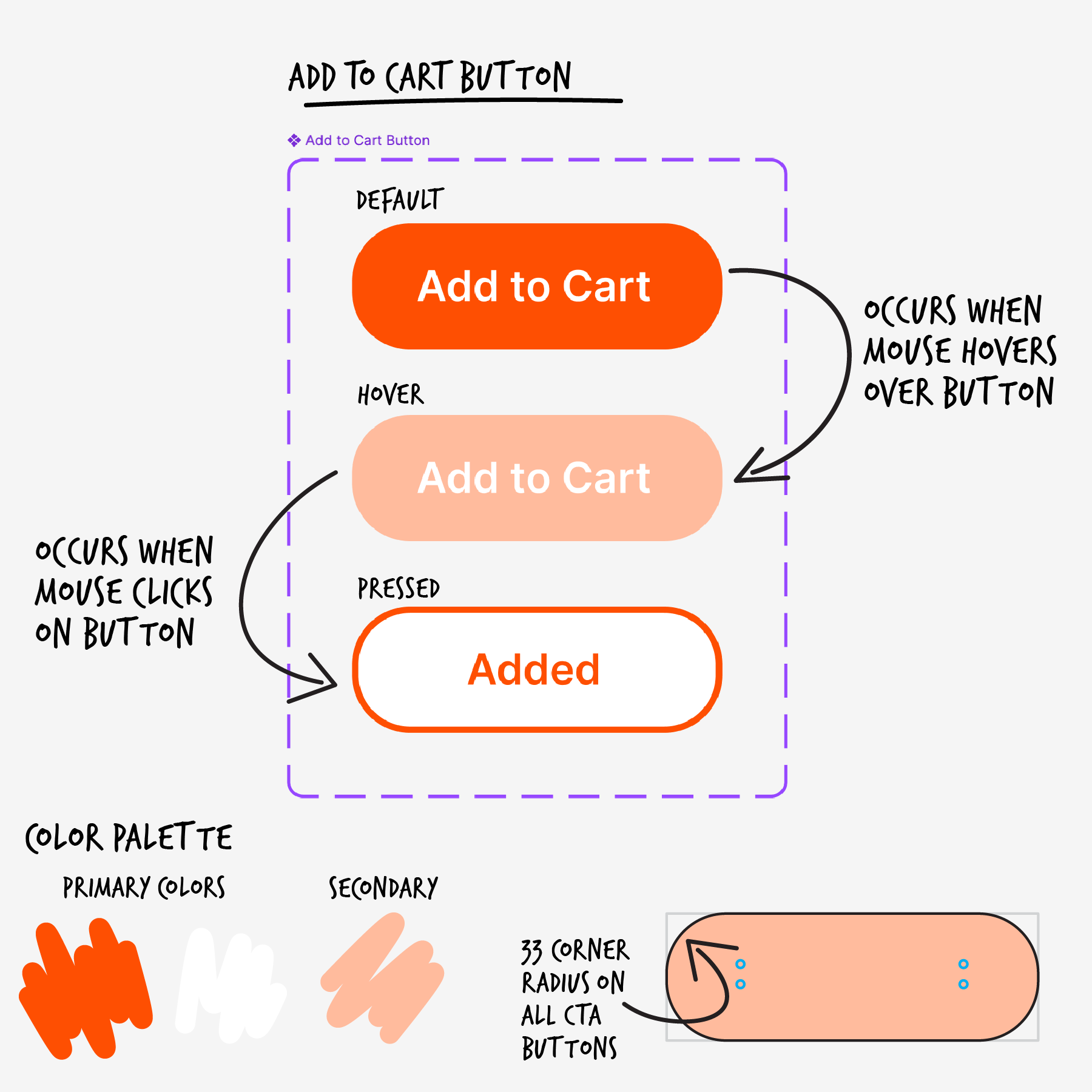
during this project, i was the sole ui/ux designer for the storefront, and assisted with the mock-ups, merchandise, and apparel design. the most challenging part—and dare i say, the most fun part—of this opportunity was combining the client’s project wishlist ‘must-haves’ with their brand guidelines, colors, and products, while still considering the overall user functionality and aesthetic of the site.
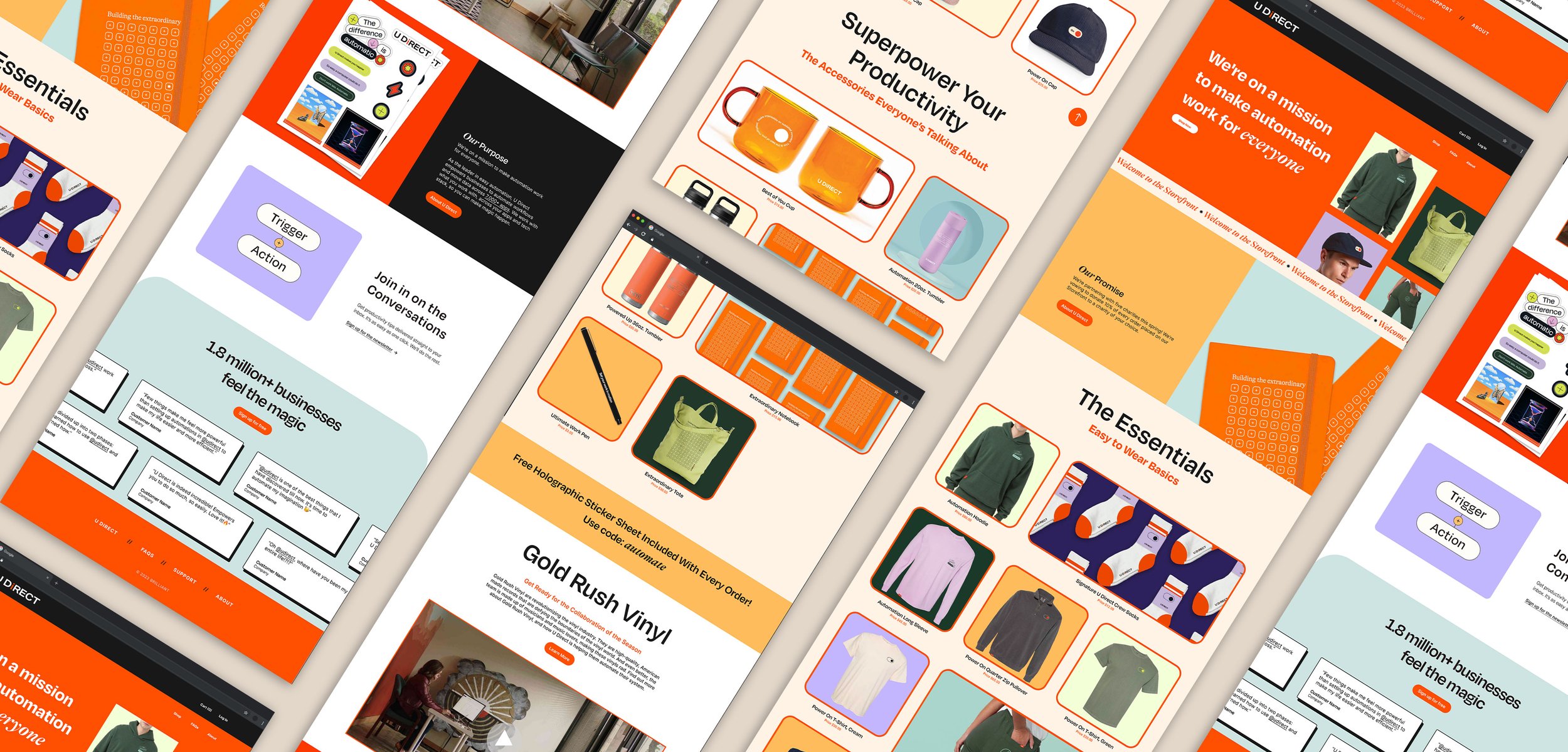
the client must-have wishlist included:
separate categories/collections for apparel & merchandise
emphasis on “shop now” (i.e. direct users to those sections repeatedly)
“back to top” button in corner of site
hover effect on the product images (on main storefront page)
banner for the free product with every purchase
sign up for newsletter section
section for reviews & testimonials
faq section
about us section + mission statement
percentage of purchase donation note
overall, i wanted the site to feel clean, colorful, retro, yet still easy to interact with. by creating the repeated square grids, it helped to make the website feel more organized, while also mimicking the client’s (rounded) square branding. i also opted to include several animated/motion designs, such as the scrolling welcome banner, anchor links (aka page jumps) throughout for quick navigation, the animated testimonials module, & more in order to increase user engagement.
the work included: graphic design, ui/ux design
note: the real client for this project is protected out of respect for an existing nda. the client’s name and content copy has been altered.
